Using the individual controls
There are four basic types of controls with different purposes:
| Function | Controls include |
|---|---|
| Invoke actions | CommandButtons, PictureButtons, PictureHyperLinks, StaticHyperLinks, Tabs, User Objects |
| Display data | ListBoxes, PictureListBoxes, DropDownListBoxes, DropDownPictureListBoxes, DataWindow controls, StaticText, ListViews, TreeViews, RichTextEdit, Graphs, Pictures, ProgressBars, ScrollBars, SingleLineEdits, MultiLineEdits, EditMasks, Tabs, User Objects, OLE controls |
| Indicate choices | RadioButtons, CheckBoxes (you can group these controls in a GroupBox), TrackBars |
| Decorative | Line, Rectangle, RoundRectangle, Oval |
How to use the controls
You should use the controls only for the purpose shown in
the table. For example, users expect radio buttons to only select
an option. Don’t use a radio button to also invoke an action,
such as opening a window or printing. Use a command button for that.
There are several exceptions: ListBoxes, ListViews, TreeViews,
and Tabs are often used both to display data and to invoke actions.
For example, double-clicking a listbox item often causes some action
to occur. User objects can be created for any purpose.
The following sections describe some features that are unique
to the individual controls.
 Not covered here This chapter does not cover the following:
DataWindow controls and objects
–see Chapter 14, “Defining DataWindow Objects “.
RichTextEdit controls
–see Chapter 22, “Working with Rich Text “.
User objects
–see Chapter 12, “Working with User Objects “.
Graph controls
–see Chapter 20, “Working with Graphs “.
OLE 2.0 controls
–see Chapter 23, “Using OLE in a DataWindow Object “.
For more information
To learn more about the proper use of controls, consult a
style guide that presents guidelines for your target environment.
For a list of events, properties, and functions for each control,
see Objects and Controls
.
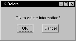
Using CommandButtons
CommandButtons are used to carry out an action. For example,
you can use an OK button to confirm a deletion or a Cancel button
to cancel a requested deletion.
Place related CommandButtons along the bottom of the window
if there are not too many. If there are a lot, place them along
the right side of the window.
You cannot change the color or alignment of text in a CommandButton.
If clicking the button opens a window that requires user interaction
before any other action takes place, use ellipsis points in the
button text (for example, Print…).
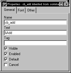
Specifying Default and Cancel buttons
You can specify that a CommandButton is the default button
in a window by selecting Default in the General property page in
the button’s Properties view.
When there is a default CommandButton and the user presses
the enter key:
- If the focus
is not
on another CommandButton, the default
button’s Clicked event is triggered - If the focus is on another CommandButton, the Clicked
event of the button with focus is triggered
Other controls affect default behavior If the window does not contain an editable field, use SetFocus()
or tab order to make sure the default button behaves as documented
above.
For information on SetFocus(), see the PowerScript
Reference
. For how to define the tab order, see “Defining the tab order “.
A bold border is placed around the default CommandButton (or
the button with focus if the user explicitly tabs to a CommandButton).
Similarly, you can define a CommandButton as being the cancel
button by selecting Cancel in the General property page in the button’s
Properties view. If you define a cancel CommandButton, when the
user presses the esc key the cancel button’s
Clicked event is triggered.
Using PictureButtons
PictureButtons are PowerBuilder-specific controls that are identical
to CommandButtons in their functionality. The only difference is
that you can specify a picture to display on the button. The picture
can be a bitmap (BMP) file, a run-length encoded (RLE) file, an
Aldus-style Windows metafile (WMF), a GIF file, an animated GIF
file, or a JPEG file.
You can choose to display one picture if the button is enabled
and a different picture if the button is disabled.
Use these controls when you want to be able to represent the
purpose of a button using a picture instead of just text.
 To specify a picture:
-
Select the PictureButton to display its
properties in the Properties view. -
In the General tab page, enter the name of the
image file you want to display when the button is enabled (or use
the browse button and choose a file). -
Enter the name of the image file you want to display
when the button is disabled (or use the Browse Disabled button and
choose a file).When you leave the text property edit box and perform your
next action, the properties are set. If the PictureButton is defined
as initially enabled, the enabled picture displays in the Layout
view. If the PictureButton is defined as initially disabled, the
disabled picture displays in the Layout view.
To specify button text alignment:
-
Select the PictureButton to display its
properties in the Properties view. -
In the General tab page, enter the text for the
PictureButton in the Text textbox.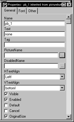
-
Use the HTextAlign and VTextAlign listboxes to
choose how you want to display the button text.
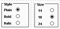
Using RadioButtons
RadioButtons are round buttons that represent mutually exclusive
options. They always exist in groups. Exactly one RadioButton is
selected in each group.
When a RadioButton is selected, it has a dark center; when
it is not selected, the center is blank.
In the following example, the text can be either plain, bold,
or italic (plain is selected):

When the user clicks a RadioButton, it becomes selected and
the previously selected RadioButton in the group becomes deselected.
Use RadioButtons to represent the state of an option. Do not
use them to invoke actions.
When a window opens, one RadioButton in a group must be selected.
You specify which is the initially selected RadioButton by selecting
the Checked property in the General property page in the RadioButton’s
Properties view.
Grouping RadioButtons
By default, all RadioButtons in a window are in one group,
no matter what their location in the window. Only one RadioButton
can be selected at a time.
You use a GroupBox control to group related RadioButtons.
All RadioButtons inside a GroupBox are considered to be in one group.
One button can be selected in each group.
The Automatic property
When a window contains several RadioButtons that are outside
of a GroupBox, the window acts as a GroupBox. Only one RadioButton
can be active at a time, unless
the checkbox
for the Automatic property on the RadioButton’s General property
page is cleared. When the Automatic property is not set, you must
use scripts to control when a button is selected. Multiple RadioButtons
can be selected outside of a group.
The Automatic property does not change how RadioButtons are
processed inside a GroupBox.
Using CheckBoxes
CheckBoxes are square boxes used to set independent options.
When they are selected, they contain a checkmark; when they are
not selected, they are empty.
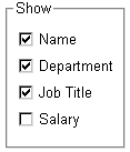
CheckBoxes are independent of each other. You can group them
in a GroupBox or rectangle to make the window easier to understand
and use, but that does not affect the CheckBoxes’ behavior;
they are still independent.
Using three states
CheckBoxes usually have two states: on and off. But sometimes
you want to represent a third state, such as Unknown. The third
state displays as a grayed box with a checkmark.
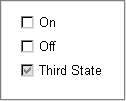
To enable the third state:
-
Select the ThreeState property in the CheckBox’s
General property page.
To specify that the button’s current state is the
third state, select ThirdState in the CheckBox’s General
tab page and clear the Checked property for the other checkboxes.
Using StaticText
You use a StaticText control to display text to the user or
to describe a control that doesn’t have text associated
with it, such as a listbox or edit control.
The user cannot change the text, but you can change the text
for a StaticText control in a script (by assigning a string to the
control’s Text property).
StaticText controls have events associated with them, but
you will probably seldom write scripts for them because users don’t
expect to interact with static text.
Indicating accelerator keys
One use of a StaticText control is to label a listbox or edit
control. If you assign an accelerator key to a listbox or edit control,
you need to indicate the accelerator key in the text that labels
the control (otherwise, the user would have no way of knowing that
an accelerator key is defined for the control). This technique is
described in “Defining accelerator keys “.
Indicating a border sytle
You can select a border style using the BorderStyle property
on the General property page.
Selecting the Border property The BorderStyle property will only affect the StaticText control
if the Border property checkbox is checked.
Using StaticHyperLinks
A StaticHyperLink is display text that provides a hot link
to a specified web page. When a user clicks the StaticHyperLink
in a window, the user’s web browser opens to display the
page.
The StaticHyperLink control has a URL property that specifies
the target of the link. You specify the text and URL in the StaticHyperLink
control’s Properties view in the General tab page.

If you know that your users have browsers that support URL
completion, you can enter a partial address–for example,
sybase.com instead of the complete address http://www.sybase.com.
When the StaticHyperLink control is in an MDI Frame window
with MicroHelp, the URL you specify will appear in the status bar
when the user’s pointer is over the control.
A hand is the default pointer and blue underlined text is
the default text. To change the font, use the Font property page.
To change the pointer, use the Other property page.
Using SingleLineEdits and MultiLineEdits
A SingleLineEdit is a box in which users can enter a single
line of text. A MultiLineEdit is a box in which users can enter
more than one line of text.
SingleLineEdits and MultiLineEdits are typically used for
input and output of data.
For these controls, you can specify many properties, including:
- Whether the box has
a border (the Border property) - Whether the box automatically scrolls as needed
(AutoHScroll and, for MultiLineEdits, AutoVScroll) - For SingleLineEdits, whether the box is a Password
box–whether to display an entry using asterisks instead
of the actual entry (Password) - In which case to accept and display the entry (TextCase)
- Whether the selection displays when the control
does not have focus (Hide Selection)
For more information about properties of these
controls, right-click in any tab page in the Properties view and
select Help from the popup menu.
Using EditMasks
Sometimes users need to enter data that has a fixed format.
For example, U.S. and Canadian phone numbers have a three-digit
area code, followed by three digits, followed by four digits. You
can use an EditMask control that specifies that format to make it
easier for users to enter values. Think of an EditMask control as
a smart SingleLineEdit: it knows the format of the data that can
be entered.
An edit mask consists of special characters that determine
what can be entered in the box. An edit mask can also contain punctuation
characters to aid the user.
For example, to make it easier for users to enter phone numbers
in the proper format, you can specify the following mask, where # indicates
a number:
|
1 |
(###) ###-#### |
During execution, the punctuation characters (the parentheses
and dash) display in the box and the cursor jumps over them as the
user types.
Edit mask character for Arabic and Hebrew The b mask character allows the entry of Arabic characters
when you run PowerBuilder on an Arabic-enabled version of Windows
and Hebrew characters when running on a Hebrew-enabled version.
It has no effect on other operating systems.
To use an EditMask control:
-
Select
the EditMask to display its properties in the Properties view. - Name the control on the General property page.
-
Select the Mask tab.
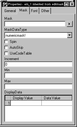
-
In the MaskDataType dropdown listbox, specify
the type of data that users will be entering into the control. -
In the Mask edit box, type the mask.
You can click the dropdown listbox button on the right and
select masks. The masks have the special characters used for the
specified data type. About masks Masks in EditMask controls in windows work the same as masks
in display formats and in the EditMask edit style in DataWindow
objects.For more information about specifying masks,
see the discussion of display formats in Chapter 16, “Displaying and Validating
Data “. -
Specify other properties for the EditMask control.
For information on the other properties, right-click
in any tab page in the Properties view and select Help from the
popup menu.
Control size and text entry The size of the EditMask control affects its behavior. If
the control is too small for the specified font size, users may
not be able to enter text.
To correct this, either specify a smaller font size or resize
the EditMask control.
Keyboard behavior
Some keystrokes have special behavior in EditMask controls.
For more information, see “The EditMask edit
style”.
Using spin controls
You can define an EditMask as a spin control,
which is an edit control that contains up and down arrows that users
can click to cycle through fixed values. For example, assume you
want to allow your users to select how many copies of a report to
print. You could define an EditMask as a spin control that allows users
to select from a range of values. The control would look like this:
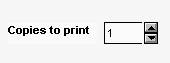
To define an EditMask as a spin control:
-
Name the EditMask and provide the data
type and mask, as described above. -
Select the Spin checkbox on the Mask property
page. -
Specify the needed information.
For example, to allow users to select a number from 1 to 20
in increments of 1, specify a spin range of 1 to 20 and a spin increment
of 1.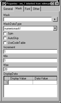
For more information on the options for spin
controls, right-click in any tab page in the Properties view and
select Help from the popup menu.
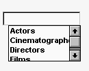
Using ListBoxes
A ListBox displays available choices. You can specify that
ListBoxes have scrollbars if more choices exist than can be displayed
in the ListBox at one time.
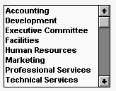
ListBoxes are an exception to the rule that a control should
either invoke an action or be used for viewing and entering data.
ListBoxes can do both. ListBoxes display data, but can also invoke
actions. Typically in Windows applications, clicking an item in
the ListBox selects the item. Double-clicking an item acts upon
the item.
For example, in the PowerBuilder Open dialog box, clicking an
object name in a ListBox selects the object. Double-clicking a name
opens the object’s painter.
PowerBuilder automatically selects (highlights) an item when
a user selects it during execution. If you want something to happen
when users double-click
an item, you must code
a script for the control’s DoubleClicked event (note that the
Clicked event is always triggered before the DoubleClicked event).
Populating the list
To add items to a ListBox, select the ListBox to display its
properties in the Properties view, select the Items tab, and enter
the values for the list. Press tab to go to the
next line.
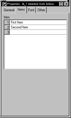
In the Items tab page, you can work with rows in this way:
| To do this | Do this |
|---|---|
| Select a row | Click the row button on the left or with the cursor in the edit box, press shift+space |
| Delete a row | Select the row and press delete |
| Move a row | Click the row button and drag the row where you want it or press shift+space to select the row and then press ctrl+uparrow or ctrl+downarrow to move the row |
| Delete text | Click the text and select Delete from the popup menu |
Changing the list during execution To change the items in the list during execution, use the
functions AddItem, DeleteItem, and InsertItem.
For more information, see the PowerScript
Reference
.
Setting tab stops
You can set tab stops for text in ListBoxes (and in MultiLineEdits)
by setting the TabStop property on the General property page. You
can define up to 16 tab stops (the default is a tab stop every eight
characters).
You can also define tab stops in a script. Here is an example
that defines two tab stops and populates a ListBox:
|
1 |
// lb_1 is the name of the ListBox.<br />string f1, f2, f3<br />f1 = "1"<br />f2 = "Emily"<br />f3 = "Foulkes"<br />// Define 1st tab stop at character 5.<br />lb_1.tabstop[1] = 5<br />// Define 2nd tab stop 10 characters after the 1st.<br />lb_1.tabstop[2] = 10<br />// Add an item, separated by tabs.<br />// Note that the ~t must have a space on either side<br />// and must be lowercase.<br />lb_1.AddItem(f1 + " ~t " + f2 + " ~t " + f3) |
Note that this script will not work if it is in the window’s
Open event (the controls have not yet been created). The best way
to specify this is in a user event that is posted in the window’s
Open event using the PostEvent function.
Other properties
For ListBoxes, you can specify whether:
- Items in the ListBox
are displayed in sorted order - The ListBox allows the user to select multiple items
- The ListBox displays scrollbars if needed
For more information, right-click in any tab
page in the Properties view and select Help from the popup menu.
Using
PictureListBoxes
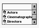
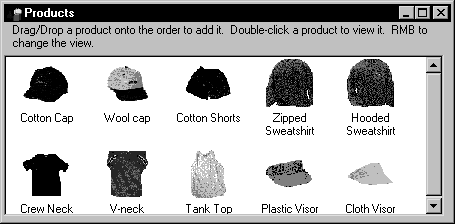
A PictureListBox, like a ListBox, displays available choices
in both text and images. You can specify that PictureListBoxes have
scrollbars if more choices exist than can be displayed in the PictureListBox
at one time.
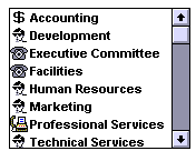
Adding images to a PictureListBox
You can choose from a group of stock images provided by PowerBuilder,
or use any bitmap (BMP) file, cursor (CUR) file, icon (ICO) file,
GIF file, or JPEG file when you add images to a PictureListBox.
Keep in mind, however, that the images should add meaning
to the list of choices. If you use a large number of images in a
list, they become meaningless.
You could, for example, use images in a long list of employees
to show the department to which each employee belongs. So you may
have a list with 20 or 30 employees, associated with one of five
images.
To add an image to a PictureListBox:
-
Select the PictureListBox control to display
its properties in the Properties view, and then select the Pictures
tab.The Pictures property page displays.
-
Use the PictureName dropdown listbox to select
stock pictures to add to the PictureListBox.or
Use the Browse button to select a bitmap (BMP) file,
icon (ICO) file, GIF file, or JPEG file to include in the PictureListBox. About cursor files To use a cursor file, you must type the filename. You can’t
select it. -
Specify a picture mask color (the color that will
be transparent for the picture). -
Specify the height and width for the image in
pixels.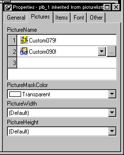
- Click OK.
On the Items tab page, you can work with rows in this way:
| To do this | Do this |
|---|---|
| Select a row | Click the row button on the left or with the cursor in the edit box, press shift+space |
| Delete a row | Select the row and press delete |
| Move a row | Click the row button and drag the row where you want it or press shift+space to select the row and then press ctrl+uparrow or ctrl+downarrow to move the row |
| Delete text | Click the text and select Delete from the popup menu |
On the Pictures tab page, you can work with rows in the same
way and also:
| To do this | Do this |
|---|---|
| Browse for a picture | Select the row and click the Browse button or press f2 |
For information about other properties, right-click
in any tab page in the Properties view and select Help from the
popup menu.
Using DropDownListBoxes
DropDownListBoxes combine the features of a SingleLineEdit
and a ListBox.
There are two types of DropDownListBoxes:
- Noneditable
- Editable
Noneditable boxes
If you want your user to choose only from a fixed set of choices,
make the DropDownListBox noneditable.
In these boxes, the only valid values are those in the list.
There are several ways for users to pick an item from a noneditable DropDownListBox:
- Use the arrow keys
to scroll through the list. - Type a character. The listbox scrolls to the first
entry in the list that begins with the typed character. Typing the
character again scrolls to the next entry beginning with the character
unless the character can be combined with the first to match an
entry. - Click the down arrow to the right of the edit control
to display the list, then select the one you want.
Editable boxes
If you want to give users the option of specifying a value
that is not in the list, make the DropDownListBox editable by selecting
the AllowEdit checkbox on the General tab page.
With editable DropDownListBoxes, you can choose to have the
list always display or not. For the latter type, the user can display
the list by clicking the down arrow.
Populating the list
You specify the list in a DropDownListBox the same way as
for a ListBox. For information, see “Using ListBoxes”.
Specifying the size of the dropdown box
To indicate the size of the box that drops down, size the
control in the Window painter using the mouse. When the control
is selected in the painter, the full size–including the
dropdown box–is shown.
Other properties
As with ListBoxes, you can specify whether the list is sorted
and whether the edit control is scrollable.
For more information, right-click in any tab
page in the Properties view and select Help from the popup menu.
Using DropDownPictureListBoxes
DropDownPictureListBoxes are similar to DropDownListBoxes
in the way they present information. Where they differ is that while
DropDownListBoxes only use text to present information, DropDownPictureListBoxes
add images to the information.
Everything that you can do with DropDownListBoxes you can
do with a DropDownPictureListBox.
For information, see “Using DropDownListBoxes”.
Adding images to a DropDownPictureListBox
You can choose from a group of stock images provided by PowerBuilder,
or use any bitmap (BMP) file, cursor (CUR) file, icon (ICO) file,
GIF file, or JPEG file when you add images to a DropDownPictureListBox.
You use the same technique that you use to add pictures to a PictureListBox.
For information, see “Adding images to a PictureListBox”.
Using pictures
Pictures are PowerBuilder-specific controls that display a bitmap
(BMP) file, a run-length encoded (RLE) file, an Aldus-style Windows
metafile (WMF), a GIF file, an animated GIF file, or a JPEG file.
To display a picture:
- Place a picture control in the window.
-
In the General tab page in the Properties view,
enter the name of the file you want to display in the PictureName
textbox or browse to select a file.The picture displays.
You can choose to resize or invert the image.
Be careful how you use picture controls. They can be used
for almost any purpose. They have events, so users can click on
them. Or they can be used simply to display an image. Be consistent
in their use so users know what they can do with them.
Using PictureHyperLinks
A PictureHyperLink is a picture that provides a hot link to
a specified web page. When a user clicks the PictureHyperLink in
a window, the user’s web browser opens to display the page.
The PictureHyperLink control has a URL property that specifies
the target of the link. You specify the picture and URL in the PictureHyperLink
control’s Properties view in the General tab page.
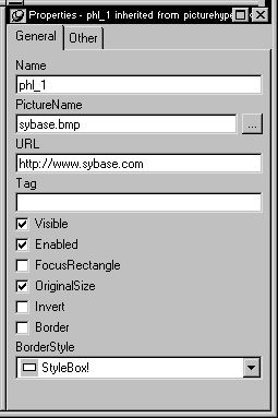
If you know that your users have browsers that support URL
completion, you can enter a partial address–for example,
sybase.com instead of the complete address http://www.sybase.com.
When the PictureHyperLink control is in an MDI Frame window
with MicroHelp, the URL you specify will appear in the status bar
when the user’s pointer is over the control.
A hand is the default pointer. To change the pointer, use
the Other property page.
The PictureHyperLink control is a descendant of the Picture
control. Like a Picture control, a PictureHyperLink control can
display a bitmap (BMP) file, a run-length encoded (RLE) file, an
Aldus-style Windows metafile (WMF), a GIF file, an animated GIF
file, or a JPEG file.
You display a picture in a PictureHyperLink control in the
same way you display a picture in a picture control. For information,
see “Using pictures”.
Using drawing objects
PowerBuilder provides the following drawing objects: Line, Oval,
Rectangle, and RoundRectangle.
Although drawing objects are usually used only to make your
window more attractive or to group controls, constructor and destructor
events are available and you can define your own unmapped events
for a drawing object. (A drawing object does not receive window
messages, so a mapped event would not be useful.)
You can use the following functions to manipulate drawing
objects during execution:
- Hide
- Move
- Resize
- Show
In addition, each drawing object has a set of properties that
define its appearance. You can assign values to the properties in
a script to change the appearance of a drawing object.
Never in front Drawing objects cannot be placed on top of another control
(that is not a drawing object), such as a GroupBox. Drawing objects always
appear
behind other controls whether or not the Bring to Front or Send
to Back items on the popup menu are set. However, drawing objects
can be on top of or behind other drawing objects.
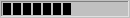
Using HProgressBarsand VProgressBars
HProgressBars and VProgressBars are rectangles that indicate
the progress of a lengthy operation, such as an installation program
that copies a large number of files. The progress bar gradually
fills with the system highlight color as the operation progresses.
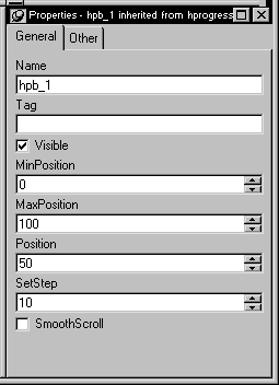
You can set the range and current position of the progress
bar in the Properties view.
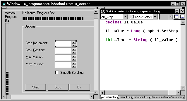
You can see an example of a window with a progress bar in
the PowerBuilder Code Examples sample application in the Examples
subdirectory in your PowerBuilder directory. See the w_progressbars
window in PBEXAMW3.PBL.
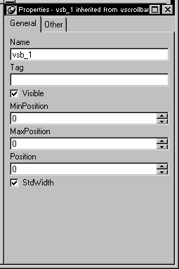
Using HScrollBars
and VScrollBars
You can place freestanding scrollbar controls within a window.
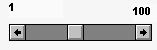
Typically, you use these controls to do one of the following:
- Act as a slider control
for users to be able to specify a continuous value - Graphically display information to the user
You can set the position of the scroll box by specifying the
value for the control’s Position property. When the user
drags the scroll box, the value of Position is automatically updated.
Using HTrackBars andVTrackBars
An HTrackBar and a VTrackBar are bars with a slider that moves
in discrete increments. Like a scroll bar, you typically use a track
bar as a slider control for users to specify a value (or see a value
you have displayed graphically), but on a discrete scale rather
than a continuous scale. Clicking on the slider moves it in discrete
increments instead of continuously.
Typically a horizontal trackbar has a series of tick marks
along the bottom of the channel and a vertical trackbar has tick
marks on the right.
Use a trackbar when you want the user to select a discrete
value. For example, you might use a trackbar to enable a user to
select a timer interval or the size of a window.
You can set properties such as minimum and maximum values,
the frequency of tick marks, and where tick marks display.
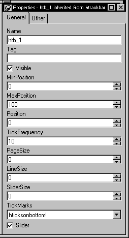
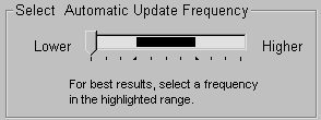
You can highlight a range of values in the trackbar with the
SelectionRange function. The range you select is indicated by a
black fill in the channel and an arrow at each end of the range.
This is useful if you want to indicate a range of preferred values.
In a scheduling application, the selection range could indicate a
block of time that is unavailable. Setting a selection range does
not prevent the user from selecting a value either inside or outside
the range.
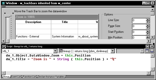
You can see an example of a window with a trackbar in the PowerBuilder Code Examples
sample application in the Examples subdirectory in your PowerBuilder directory.
See the w_trackbars window in PBEXAMW3.PBL.
Using
Tab controls
A Tab control is a container for tab pages that display other
controls. You can add a Tab control to a window in your application
to present information that can logically be grouped together but
may also be divided into distinct categories. An obvious implementation
of the Tab control is the use of tab pages in the Properties view
for all objects in PowerBuilder.
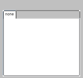
When you add a Tab control to a window, PowerBuilder creates
a Tab control with one tab page. The control is rectangular. To
select the control, click the tab itself (text says none
)
or the area (gray in this picture) to the right of the tab. To select
the tab page, click in the area below the tab.
Creating a Tab control
To add a Tab control to a window:
-
In the Window painter, choose the Tab control
and click in the window.
Adding tab pages to a Tab control
You add additional tab pages to the tab control.
To create a new tab page within the Tab control:
-
Right-click the Tab control (not the first
tab page, which is currently the only page in the Tab control).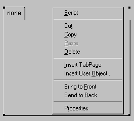
- Choose Insert TabPage from the popup menu.
- Add controls to the new tab page.
Defining a user object that is a tab page and adding
it to a Tab control
You can create reusable tab pages in the User Object painter
by defining a tab page with controls on it that is independent of
a Tab control. Then you can add that tab page to one or more Tab
controls.
To define a tab page independent of a Tab control:
-
Click the New button on the PowerBar and
use the Custom Visual icon on the Object tab page to create a custom
visual user object. -
Size the user object to match the size of the
Tab controls you will use it in (as shown in the next procedure). -
Add the controls to the user object that you want
to appear on the tab page. -
Select the user object (not a control) and in
the Properties view, specify the information to be used by the tab
page.In the General tab page, you can set:
- Text–The
text to be displayed on the tab
In the TabPage tab page, you can set:
- PictureName–A picture to appear
on the tab with or instead of the text - PowerTipText–Text for a popup message that
displays when the user moves the cursor to the tab - Colors for the tab and the text on the tab
- Text–The
Now you add the tab page (which is a user object) to a Tab
control.
To add a tab page that exists as an independent
user object to a Tab control:
-
In the Window painter, right-click the
Tab control. - Choose Insert User Object from the popup menu.
- Select a user object and click OK.
A tab page, inherited from the user object you selected, is
inserted. You can set tab page properties and write scripts for
the inherited user object just as you do for tab pages defined within
the Tab control.
You can’t edit the content of the user object within
the Tab control. If you want to edit the controls, go back to the
User Object painter to make changes.
Manipulating the Tab control
To change the name and properties of the Tab control:
-
Click the Tab control (anywhere in the
tab area that isn’t a tab) to display the Tab control properties
in the Properties view. - Edit the properties.
For more information, right-click in any tab
page in the Properties view and select Help from the popup menu.
To change the scripts of the Tab control:
-
Double-click the Tab control.
or
With the mouse anywhere in the control except on a tab,
display the popup menu and select Script. - Select a script and edit it.
To resize a Tab control:
-
Grab a border of the control and drag it
to the new size.The Tab control and all tab pages are sized as a group.
To move a Tab control:
-
Drag anywhere except on the tabs to move
the control to the new position.The Tab control and all tab pages are moved as a group.
Manipulating the tab pages
To view a different tab page:
-
Click on the page’s tab.
The tab page is brought to the front. The tabs are rearranged
according to the TabPosition setting you have chosen.
To change the name and properties of a tab page:
-
Select the tab.
It may move to the position for a selected tab based on the
TabPosition setting. -
Click on the tab page–in its new position,
if necessary. - Edit the properties.
To change the scripts of the tab page:
-
Select the tab.
It may move to the position for a selected tab based on the
Tab Position setting. - Select Script from the tab’s popup menu.
- Select a script and edit it.
To delete a tab page from a Tab control:
-
With the mouse on the tab corresponding
to the tab page to be deleted display the popup menu and choose
Cut or Delete.
Managing controls on tab pages
To add a control to a tab page:
-
Choose a control from the toolbar or the
Control menu and click on the tab page, just as you would add a
control to a window.
For more information on the Tab control, see
the chapter on using tabs in a window in Application Techniques
.
You can only add controls to a tab page created within the
Tab control. To add controls to an independent tab page, open it
in the User Object painter.
To move a control from one tab page to another:
-
Cut or copy the control and paste it on
the destination tab page.
The source and destination tab pages must be embedded tab
pages, not independent ones created in the User Object painter.
To move a control between a tab page and the window
containing the Tab control:
-
Cut or copy the control and paste it on
the destination window or tab page.
Moving the control between a tab page and the window changes
the control’s parent, which affects scripts that refer
to the control.
For more information on the Tab control, see the chapter on
using tabs in a window in Application Techniques
.
Using
TreeView controls
You can use TreeView controls in your application to represent
relationships between hierarchical data. An example of a TreeView
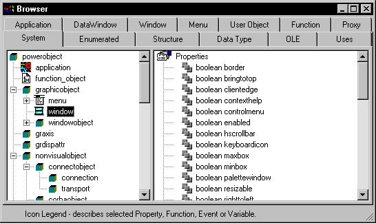
implementation is PowerBuilder’s Browser. The tab pages in
the Browser contain TreeView controls.
Creating a TreeView control
To add a TreeView control to a window:
-
In the Window painter, choose the TreeView
control and click in the window.
Adding TreeView items and pictures
A TreeView consists of TreeView items that are associated
with one or more pictures. You add images to a TreeView in the same
way that you add images to a PictureListBox.
For more information, see “Adding images to a PictureListBox”.
Dynamically changing image size The image size can be changed during execution by setting
the PictureHeight and PictureWidth properties when you create a
TreeView.
For more information about PictureHeight and
PictureWidth, see the PowerScript Reference.
To add items to a TreeView:
-
Write a script in the TreeView constructor
event to create TreeView items.For more information about populating a TreeView,
see the PowerScript Reference.
Adding state pictures to TreeView items
A state
picture is an image that appears
to the left of the TreeView item indicating that the item is not
in its normal mode. A state picture could indicate that a TreeView
item is being changed, or that it is performing a process and is unavailable
for transaction.
To specify a state picture for a TreeView item:
-
Select the TreeView control to display
its properties in the Properties view and then select the State
tab. -
Use the StatePictureName dropdown listbox to select
stock pictures to add to the TreeView.or
Use the Browse button to select any bitmap (BMP) file,
icon (ICO) file, GIF file, or JPEG file. To specify a cursor file To use a cursor file, you must type the filename. You can’t
select it.
Working in the Properties view with the rows in the State
or Pictures tab page is the same as working with them in a ListView
control. For information, see “Using ListView controls”.
To activate a state picture for a TreeView item:
-
Write a script that changes the image when
appropriate.For example, the following script gets the current TreeView
item and displays the state picture for it.1long ll_tvi<br />treeviewitem tvi<br /><br />ll_tvi = tv_foo.finditem(currenttreeitem! , 0)<br />tv_foo.getitem(ll_tvi , tvi)<br />tvi.statepictureindex = 1<br />tv_foo.setitem ( ll_tvi, tvi )For more information on the TreeView control,
see Application Techniques
.
Setting other properties
To specify other TreeView properties:
-
Select the TreeView control to display
its properties in the Properties view and then select the General
tab. -
Enter a name for the TreeView in the Name textbox and
specify other properties as appropriate. Among the properties you
can specify on the General property page are:- The border style
- Whether the TreeView has lines showing the item
hierarchy - Whether the TreeView includes collapse and expand
buttons - Whether the user can delete items
- Whether the user can drag and drop items into the
TreeView
For more information, right-click in any tab
page in the Properties view and select Help from the popup menu. -
For other options, choose the tab appropriate to the
property you want to specify:To specify Choose this tab The images used to represent TreeView
itemsPictures The state images for the TreeView items State The font size, family, and color for
TreeView itemsFont The size and position of the TreeView Other The icon for the mouse pointer in the
TreeViewOther The icon for a drag item, and whether
the drag-and-drop must be performed programmaticallyOther For more information on the TreeView control,
see Application Techniques
. For information
about its properties, see Objects and Controls
.
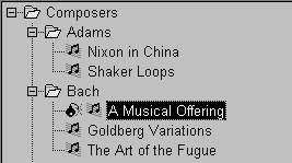
Using ListView controls
A ListView control lets you display items and icons in a variety
of arrangements. You can display large or small icons in freeform
lists, and you can associate additional columns with items in the
list. The following illustration from the Code Examples application
shows a ListView control used in a sales order application.
Creating a ListView control
To add a ListView control to a window:
-
In the Window painter, choose the ListView control
tool and click in the window.
Adding ListView Items and pictures
Adding images to a ListView control is the same as adding
images to a PictureListBox. The ListView control’s Properties
view has two tab pages for adding pictures: Large Picture (default
size 32 by 32 pixels) and Small Picture (16 by 16 pixels).
For more information, see “Adding images to a PictureListBox”.
To add ListView items:
-
Select the ListView control to display
its properties in the Properties view and then select the Items
tab.The Items property page displays.
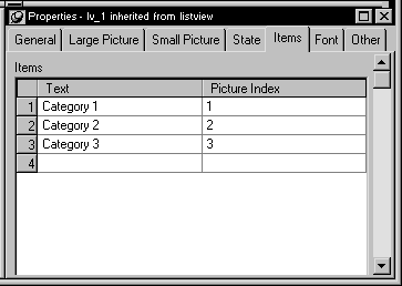
-
Enter the name of the ListView item and the picture
index you want to associate with it. This picture index corresponds
to the images you select on the Large Picture, Small Picture, and
State property pages.On the Items tab page, you can work with rows in this way:
To do this Do this Select a row Click the row button on the left or with
the cursor in the edit box, press shift+spaceDelete a row Select the row and press delete Move a row Click the row button and drag the row
where you want it or press shift+space to
select the row and then press ctrl+uparrow or ctrl+downarrow
to move the rowDelete text Click the text and select Delete from
the popup menuIn the Large Picture, Small Picture, and State tab pages,
you can work with rows in the same way and also:To do this Do this Browse for a picture Select the row and click the Browse button
or press f2 - Repeat until all the items are added to the ListView.
Choosing a ListView style
You can display a ListView in four styles:
- Large icon
- Small icon
- List
- Report
To select a ListView style:
-
Select the ListView control to display
its properties in the Properties view and then select the General
tab. -
Select the type of view you want from the View
dropdown list.
For more information about other properties,
right-click in any tab page in the Properties view and select Help
from the popup menu.
Setting other properties
To specify other ListView properties:
-
Select the ListView control to display its properties
in the Properties view. -
Choose the tab appropriate to the property you want
to specify:To specify Choose this tab The border style General Whether the user can delete items The images for ListView items in LargeIcon
viewLarge Picture The images for ListView items in Small
Icon, list, and report viewsSmall Picture The state images for ListView items State The names and associated picture index
for ListView itemsItems The font size, family, and color for
ListView itemsFont The size and position of the ListView Other The icon for the mouse pointer in the
ListViewThe icon for a drag item, and whether
the drag-and-drop must be performed programmatically
For more information on the ListView control,
see Application Techniques
. For information
about its properties, see Objects and Controls
.