Working with edit styles
You can define edit styles for columns. Edit styles specify
how column data is presented in DataWindow objects. Unlike display formats,
edit styles don’t only affect the display of data; they
also affect how users interact with the data during execution.
Once you define an edit style, it can be used by any column of the
appropriate data type in the database.
When edit styles are used
If both a display format and an edit style have been assigned
to a column, the edit style is always used, with one exception.
When you assign an EditMask edit style to a column, you can check
the Use Format check box on the Format property page for the column
to use the edit mask format when focus is on the column, and the
display format mask when focus is off the column.
Edit styles
You can choose from the following edit styles:
| Edit style | What the edit style does | Example |
|---|---|---|
| Edit box (default) | Displays a value in the boxFor data entry, type a value | 
|
| DropDownListBox | Displays a value from the dropdown listFor data entry, select or enter a value | 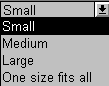
|
| CheckBox | Displays a check box selected or clearedFor data entry, select or clear the check box | 
|
| RadioButtons | Displays radio buttons, one of which is selectedFor data entry, select one of the radio buttons |

|
| Edit Mask | Displays formatted dataFor data entry, type a value | 
|
| DropDownDataWindow | Displays a value from a dropdown DataWindowFor data entry, select a value | 
|
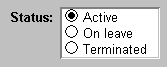
For example, if you have a column Status that takes one of
three values (A, T, or L), you might assign it the RadioButton edit
style:
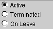
The Status data will be presented as radio buttons. Users can
simply click a button instead of having to type A, T, or L (and
you don’t have to create a validation rule to validate
the typed input).
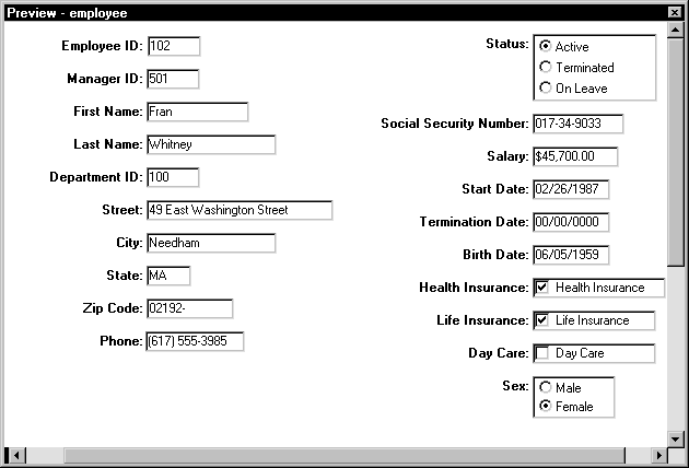
Here’s a DataWindow object that uses several edit styles:
Edit Mask, DropDownListBox, CheckBox, and RadioButtons:
Using edit styles
You work with edit styles in the Database painter and DataWindow painter.
What you do in the Database painter
In the Database painter, you can:
- Create, modify, and delete named edit styles
The edit styles are stored in the extended attribute system
tables. Once you define an edit style, it can be used by any column
of the appropriate data type in the database. - Assign edit styles to columns
These styles are used by default when you place the column
in a DataWindow object in the DataWindow painter.
What you do in the DataWindow painter
In the DataWindow painter, you can:
- Accept the default edit style assigned to a column in the
Database painter - Override the default edit style with another named
style stored in the extended attribute system tables - Create an ad hoc, unnamed edit style to use with
one specific column
Edit styles and the extended attribute system
tables
Once you have placed a column in a DataWindow object and have given
it an edit style (either the default style from the assignment made
in the Database painter for the column or a style assigned in the DataWindow painter), PowerBuilder records
the name and definition of the edit style in the DataWindow object.
However, if the definition of the edit style later changes
in the extended attribute system tables, the edit style for the
column in a DataWindow object will not change automatically. You can update
the column by reassigning the edit style to it in the DataWindow object.
Working with edit styles in the Database painter
Typically, you define edit styles in the Database painter,
because edit styles are properties of the data itself. Once defined
in the Database painter, the styles are used by default each time
the column is placed in a DataWindow object.
 To create a new edit style:
-
In the Database painter, select Object>Insert>Edit
Style from the menu bar. -
In the Edit Style dialog box, select the edit
style type from the Style dropdown list. -
Specify the properties of the edit style and click
OK.For information, see “Defining edit styles”.
You can use the new edit style with any column of the appropriate
data type in the database.
To modify an existing edit style:
-
In the Database painter, open the Extended
Attributes view. -
In the Extended Attributes view, open the list
of edit styles. -
Position the pointer on the Edit style you want
to modify, display the pop-up menu, then select Properties. -
In the Edit Style dialog box, modify the edit
style as desired and click OK.For information, see “Defining edit styles”.
You can use the modified edit style with any column of the
appropriate data type in the database.
To associate an edit style with a column in the
Database painter:
-
In the Database painter (Objects view),
position the pointer on the column, select Properties from the pop-up
menu, then select the Edit Style tab in the Properties view. -
Select a style for the appropriate data type from
the list in the Style Name box.PowerBuilder associates the selected edit style with the column
in the extended attribute system tables.
To remove an edit style from a column in the Database
painter:
-
In the Database painter (Objects view),
position the pointer on the column, select Properties from the pop-up
menu, then select the Edit Style tab in the Properties view. -
Select (None) from the list in the Style Name
box.The edit style is no longer associated with the column.
Working
with an edit style for a column in the DataWindow painter
An edit style you assign to a column in the Database painter
is used by default when you place the column in a DataWindow object. You
can override the edit style in the DataWindow painter by choosing another
edit style from the extended attribute system tables or defining
an ad hoc style for one specific column.
To specify an edit style for a column:
-
In the DataWindow painter, move the pointer to
the column, select Properties from the column’s pop-up
menu, and then select the Edit tab. -
Select the type of edit style you want from the
Style Type dropdown list.The information on the Edit property page changes to be appropriate
to the type of edit style you selected. -
Do one of the following:
- Select an edit style from the Style Name box.
- Create an ad hoc edit style for the column, as described
in “Defining edit styles”.
Defining edit styles
This section describes how to specify each type of edit style.
The
Edit edit style
By default, columns use the Edit edit style, which displays
data in an edit control. You can customize the appearance and behavior
of the edit control by modifying a column’s Edit edit style.
To do so, select Edit in the Style Type dropdown list and specify
the properties for that style:
- To
restrict the number of characters users can enter, enter a
value in the Limit box. - To convert the case of characters upon display,
enter an appropriate value in the Case box. - To have entered values display as asterisks for
sensitive data, check the Password box. - To allow users to tab to the column but not
change the value, check the Display Only box. - To define a code table to determine which values
are displayed to users and which values are stored in the database,
check the Use Code Table box and enter display and data values for
the code table.
See “Defining a code table”.
To use the Edit edit style:
-
Select Edit from the Style Type box, if
it is not already selected. - Select the properties you want.
 Date columns and regional settings Using the Edit edit style, or no edit style, with a date column
can cause serious data entry and validation problems if a user’s
computer is set up to use a nonstandard date style, such as yyyy/dd/mm.
For example, if you enter 2001/03/05 in the Retrieval
Arguments dialog box for a date column when the mask is yyyy/dd/mm,
the date is interpreted as March 5 instead of May 3, To ensure that
the order of the day and month is interpreted correctly, use an EditMask
edit style.
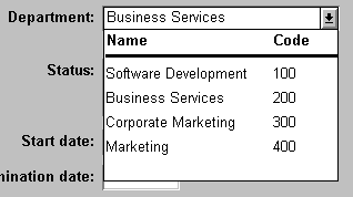
The DropDownListBox edit style
You can use the DropDownListBox edit style to have columns
display as dropdown listes during execution:
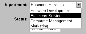
Typically, this edit style is used with code tables, where
you can specify display values (which users see) and shorter
data values (which are stored in the database).
In the DropDownListBox edit style, the display values of the
code table display in the ListBox portion of the DropDownListBox. The
data values are the values that are put in the DataWindow buffer
(and sent to the database when an Update is issued) when the user
selects an item in the ListBox portion of the dropdown list.
In the preceding example, when users see the value Business
Services, the corresponding data value could be 200.
To use the DropDownListBox edit style:
-
Select DropDownListBox from the Style Type
box. - Select the appropriate properties.
-
Enter the value you want to appear in the Display
Value box and the corresponding data value in the Data Value box.
During execution
You can define and modify a code table for a column in a script by
using the SetValue function during execution. To obtain the value
of a column during execution, use the GetValue function. To clear
the code table of values, use the ClearValues function.
For more about code tables, see “Defining a code table”.
The CheckBox edit style
If a column can take only one of two (or perhaps three) values,
you might want to display the column as a check box; users can
select or clear the check box to specify a value. In the following
entry from a DataWindow object, users can simply check or clear a
box to indicate whether an employee has health insurance:

To use the CheckBox edit style:
-
Enter in the Text box the text you want displayed
next to the check box. Using accelerator keys If the CheckBox has an accelerator key, enter an ampersand
(&) before the letter in the text that represents the accelerator
key. -
Enter in the Data Value For boxes the values you want put
in the DataWindow buffer when the CheckBox is checked (on) or unchecked (off).If you selected the 3 States box, an optional third state
box (other) appears, for the case when the condition is neither
on nor off.
What happens
The value you enter in the Text box becomes the display value,
and values entered for On, Off, and Other become the data values.
When users check or clear the check box during execution, PowerBuilder enters
the appropriate data value in its buffer. When the Update function
is issued, PowerBuilder sends the corresponding data values to the
database.
Centering check boxes without text
You may find it useful to center check boxes used for columns
of information. First make the text control used for the column
header and the column control the same size and left aligned. Then
you can center the check boxes and the column header.
To center check boxes without text:
-
In the Edit property page for the column,
make sure the Left Text check box is not selected and that the Text
box where you specify associated text is empty. -
In the General property page, specify centering
(Alignment>Center) or specify centering using the StyleBar.
The RadioButtons edit style
If a column can take one of a small number of values, you
might want to display the column as radio buttons:
To use the RadioButtons edit style:
-
Specify how many radio buttons will display
in the Columns Across box. -
Enter a set of display and data values for each
button you want to display.The display values you enter become the text of the buttons;
the data values are put in the DataWindow buffer when the button
is clicked. Using accelerator keys To use an accelerator key on a radio button, enter an ampersand
(&) in the Display Value before the letter that will be
the accelerator key.
What happens
Users select values by clicking a radio button. When the Update
function is issued, the data values are sent to the database.
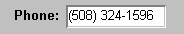
The EditMask editstyle
Sometimes users need to enter data that has a fixed format.
For example, in North America phone numbers have a 3-digit area
code, followed by three digits, followed by four digits. You can
define an edit mask that specifies the format to make it easier
for users to enter values:
Edit masks consist of special characters that determine what
can be entered in the column. They can also contain punctuation
characters to aid users.
For example, to make it easier for users to enter phone
numbers in the proper format, specify this mask:
|
1 |
(###) ###-#### |
During execution, the punctuation characters display in the
box and the cursor jumps over them as the user types:

Special characters and keywords
Edit masks use the same special characters as display formats,
and there are special considerations for using numeric, string,
date, and time masks.
For information, see “Defining display formats”.
Keyboard behavior
Note the following about how certain keystrokes behave in
edit masks:
- Both Backspace
and Shift + Backspace delete the preceding character - Delete deletes everything that is selected
- Non-numeric edit masks treat any characters that
don’t match the mask pattern as delimiters
Also, note certain behavior in Date edit masks:
- Entering zero for the day
or month causes the next valid date to be entered. For example,
if the edit mask is DD/MM/YY, typing 00/11/01 results
in 01/11/01.
You can override this behavior in the development environment by
adding the following lines to your PB.INI file:1[Edit Mask Behaviors]<br /> AutocompleteDates=noFor deployed applications, the date is completed automatically
unless you provide a file called PB.INI in the same directory as
the executable file that contains these lines. Note that this section
must be in a file called PB.INI. Adding the section to a different
INI file shipped with the application will have no effect. - The strings 00/00/00 or 00/00/0000
are interpreted as the NULL value for the column.
Using the Mask pop-up menu
Click the button to the right of the Mask box on the Mask
property page to display a list that contains complete masks that
you can click to add to the mask box, as well as special characters
that you can use to construct your own mask. For example, the menu
for a Date edit mask contains complete masks such as mm/dd/yy
and dd/mmm/yyyy. It also has components such as
dd and jjj (for a Julian day). You might use these to construct
a mask like dd-mm-yy, typing in the hyphens as separators.You cannot
use a partial mask, such as dd or mmm, in a date edit mask. Any mask
that does not include any characters representing the year will
be replaced by a mask that does.
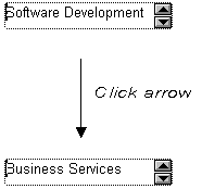
Using spin controls
You can define an edit mask as a spin control, a box that
contains up and down arrows that users can click to cycle through
fixed values. For example, you can set up a code table that provides
the valid entries in a column; users simply click an arrow
to select an entry. Used this way, a spin control works like a dropdown
list that displays one value at a time:
For more about code tables, see “Defining a code table”.
To use an EditMask edit style:
-
Select EditMask in the Style Type box if it is
not already selected. -
Define the mask in the Mask box. Click the special characters
in the pop-up menu to use them in the mask. To display the pop-up
menu, click the button to the right of the Mask box. -
Specify other properties for the edit mask.
When you use your EditMask, check its appearance and behavior.
If characters do not appear as you expect, you may want to change
the font size or the size of the EditMask.
The DropDownDataWindow edit style
Sometimes another data source determines which data is valid
for a column.
Consider this situation: the Department table includes two
columns, Dept_id and Dept_name, to record your
company’s departments. The Employee table records your
employees. The Department column in the Employee table can have
any of the values in the Dept_id column in the Department
table.
As new departments are added to your company, you want the DataWindow object containing
the Employee table to automatically provide the new departments
as choices when users enter values in the Department column.
In situations such as these, you can specify the DropDownDataWindow
edit style for a column: it is populated from another DataWindow object.
When users go to the column, the contents of the DropDownDataWindow
display, showing the latest data:
To use the DropDownDataWindow edit style:
-
Create a DataWindow object that contains the columns
in the detail band whose values you want to use in the column.You will often choose at least two columns: one column that
contains values that the user sees and another column containing
values to be stored in the database. In the example above, you would
create a DataWindow object containing the Dept_ID and Dept_Name
columns in the Department table. Assume this DataWindow object is named d__dddw_dept. -
For the column getting its data from the DataWindow object,
select the DropDownDataWindow edit style.In the example, you would specify the DropDownDataWindow edit
style for the Department column in the Employee table: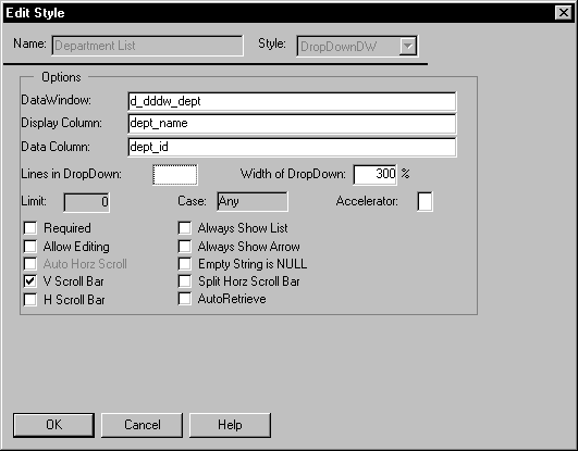
-
In the DataWindow box, select the DataWindow object that contains
the data for the column from the dropdown list (in the example, d__dddw_dept).
(When you click the edit box, you will see the list.) -
In the Display Column box, select the column containing
the values that will display in the DataWindow object (in the example,
Dept_Name). -
In the Data Column box, select the column containing
the values that will be stored in the database (in the example,
Dept_ID). -
Specify other properties for the edit style and click
OK when done.
What happens
During execution, when data is retrieved into the DataWindow object,
the column whose edit style is DropDownDataWindow will itself be
populated as data is retrieved into the DataWindow object serving as the
dropdown DataWindow object.
When the user goes to the column and drops it down, the contents
of the dropdown DataWindow object display. When the user selects a display
value, the corresponding data value is stored in the DataWindow
buffer and is stored in the database when an Update is issued.
Limit on size of data value The data value for a column that uses the DropDownDataWindow
edit style is limited to 511 characters.
Defining a code table
To reduce storage needs, you frequently want to store short,
encoded values in the database. But these encoded values may not
be meaningful to users. To make DataWindow objects easy to use, you can
define code tables.
Each row in a code table is a pair of corresponding values:
a display value and a data value. The display values are those users see during
execution. The data values are those that are saved in the database.
Limit on size of data value The data value you specify for the Checkbox, DropDownListBox,
Edit, EditMask, and RadioButtons edit styles is limited to 255 characters.
How code tables are implemented
You can define a code table as a property of the following
column edit styles:
- Edit
- DropDownListBox
- RadioButtons
- DropDownDataWindow
- EditMask, using spin control
The steps to specify the code table property for each edit
style are similar: you begin by defining a new edit style in the
Database painter. Once you select an edit style, use the following
specific procedure to define the code table property.
For how to create an edit style, see “Working with edit styles “.
Allowing NULL values An internal PowerBuilder code, NULL!, indicates NULL values
are allowed. To use this code, specify NULL! as the data value,
then specify a display format for NULLs for the column.
To define a code table as a property of the Edit
edit style:
- Select the Use Code Table check box.
-
Enter the display and data values for the code
table. -
If you want to restrict input in the column to
values in the code table, select the Validate check box.For more information, see “Validating user input”.
To define a code table as a property of the DropDownListBox
edit style:
-
Enter the display and data values for the
code table. -
If you want to restrict input in the column to
values in the code table, clear the Allow Editing check box.For more information, see “Validating user input”.
To define a code table as a property of the RadioButtons
edit style:
-
Enter the display and data values for the
code table.
To define a code table as a property of the DropDownDataWindow
edit style:
-
Specify the column that provides the display
values in the Display Column box. -
Specify the column that provides the data values
in the Data Column box. -
If you want to restrict input to values in the
code table, clear the Allow Editing check box.
To define a code table as a property of the EditMask
edit style:
- Select the Spin Control check box.
- Select the Code Table check box.
-
Enter the display and data values for the code
table.
How code tables are processed
When data is retrieved into a DataWindow object column with a code
table, processing begins at the top of the data value column. If
the data matches a data value, the corresponding display value displays.
If there is no match, the actual value displays.
Consider this example:
| Display values | Data values |
|---|---|
| Massachusetts | MA |
| Massachusetts | ma |
| ma | MA |
| Mass | MA |
| Rhode Island | RI |
| RI | RI |
If the data is MA or ma, the corresponding display value (Massachusetts) displays.
If the data is Ma, there is no match, so Ma displays.
Case sensitivity Code table processing is case sensitive.
If the code table is in a DropDownListBox edit style, and
if the column has a code table that contains duplicate display values,
then each value displays only once. So if this code table is defined
for a column in a DataWindow object that has a DropDownListBox edit style,
Massachusetts and Rhode Island display in the ListBox portion of
the DropDownListBox.
Validating user input
When users enter data into a column in a DataWindow object,
processing begins at the top of the display value column of the
associated code table.
If the data matches a display value, the corresponding data
value is put in the internal buffer. For each display value, the
first data value is used. Using the sample code table, if the user
enters Massachusetts, ma, or Mass, MA is the data value.
You can specify that only
the values
in the code table are acceptable:
- For a column using the Edit edit style, select the Validate
check box.
If you have selected the Validate check box for the Edit edit
style, an ItemError event is triggered whenever a user enters a
value not in the code table. Otherwise, the entered value is validated
using the column’s validation rule, if any, and put in
the DataWindow buffer. - For the DropDownListBox and DropDownDataWindow edit
styles, clear the Allow Editing check box: users cannot type
a value.
When the code table processing is complete, the ItemChanged
or ItemError event is triggered.
Code table data The data values in the code table must pass validation for
the column and must have the same data type as the column.