Working in the DataWindow painter
The DataWindow painter provides six views related to the DataWindow object you
are working on. Interacting with these views is how you work in
the DataWindow painter.
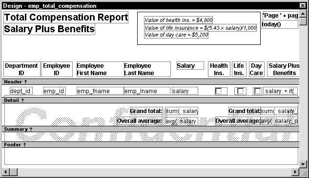
The following picture shows a DataWindow object in the DataWindow painter with
three views open: the Design view, the Preview view, and the Properties view.

Design view Shows a representation of the DataWindow object and its controls.
You use this view to design the layout and appearance of the DataWindow object.
Changes you make are immediately shown in the Preview view and the
Properties view.
Preview view Shows the DataWindow object with data as it will appear at execution
time. If the Print Preview toggle is selected, you see the DataWindow object as
it would appear when printed.
Properties view Displays the property sheet for the currently selected control(s)
in the DataWindow object, for the currently selected band in the DataWindow object,
or for the DataWindow object itself. You can view and change the values
of properties in this view.
There are three other views available:
Control List view List all controls in the DataWindow object. Selecting controls in
this view selects them in the Design view and the Properties view too.
You can also sort controls by Control Name, Type, or Tag.
Data view Displays the data that can be used to populate a DataWindow object and
allows manipulation of that data.
Column Specifications view Shows a list of the columns in the data source. For the columns,
you can add, modify, and delete initial values, validation expressions,
and validation messages. You can also specify that you want a column
to be included in a prompt for retrieval criteria during data retrieval.
To add a column to the DataWindow object, you can drag and drop the column from
the Column Specifications view to Design view. For external or stored procedure
data sources, you can add, delete, and edit columns (column name, type,
and length).
Understanding the DataWindow painter Design view
With many presentation styles, the DataWindow painter Design view
is divided into areas called bands. Each
band corresponds to a section of the displayed DataWindow object.
 Applicability of information Some of the information presented in this section doesn’t
apply to all DataWindow object presentation styles.
A DataWindow object is divided into four bands: header, detail, summary,
and footer. Each band is identified by a bar containing the name
of the band above the bar and an arrow pointing to the band.
Here is the Design view for a tabular DataWindow object:
| Band | Used to display |
|---|---|
| Header | Information at the top of every screen or page, such as the name of the report or current date |
| Detail | Data from the database or other data source |
| Summary | Summary information that displays after all the data, such as totals and counts |
| Footer | Information displayed at the bottom of every page or screen, such as page number and page count |
About the header band
The header band contains heading information that is displayed
at the top of every screen or page. The presentation style
determines the contents of the header band:
- If the presentation style is Tabular, Grid, or N-Up,
the headings defined for the columns in the Database painter display
in the header band and the columns display on a single line across
the detail band - If the presentation style is Freeform, the header
band is empty and labels display in the detail band next to each
column
You can specify additional heading information (such as a
date) in the header band and can include pictures, graphic controls, and
color to enhance the appearance of the band.
Displaying the current date To include the current date in the header, you place a computed
field that uses the Today DataWindow expression function in the header band.
For information, see “Adding computed fields to
a DataWindow object”.
About the detail band
The detail band displays the retrieved data. It is also where
the user enters new data and updates existing data. The number of
rows of data that display in the DataWindow object at one time is determined
by the following expression:
|
1 |
<i>(Height of the DataWindow object - Height of headers and footers) / <br /> Height of the detail band</i> |
The presentation style determines the contents of the detail
band:
- If the presentation style is Tabular, Grid, N-Up,
or Label, the detail band displays column names, representing the
columns - If the presentation style is Freeform, the labels
defined for the columns in the Database painter display in the detail
band with boxes for the data to the right
How PowerBuilder names the columns in the Design view If the DataWindow object uses one table, the names of the columns
in the Design view are the same as the names in the table.
If the DataWindow object uses more than one table, the names of the
columns in the Design view are tablename_columnname
. PowerBuilder prefaces
the name of the column with the table name to prevent ambiguity,
since different tables can have columns with the same name.
When you design the detail band of a DataWindow object, you can specify display and
validation information for each column of the DataWindow object and add
other controls, such as text, pictures, graphs, and drawing controls.
About the summary and footer bands
You use the summary and footer bands of the DataWindow object the
same way you use summary pages and page footers in a printed report:
- The contents of the summary
band display at the end, after all the detail rows; this band often
summarizes information in the DataWindow object - The contents of the footer band display at the bottom
of each screen or page of the DataWindow object; this band often displays
the page number and name of the report
These bands can contain any information you want, including
text, drawing controls, graphs, and computed fields containing aggregate
totals.
Using the DataWindow painter toolbars
The DataWindow painter contains three customizable PainterBars and
a StyleBar.
For more information about using toolbars,
see “Using toolbars”.
PainterBars
The PainterBars include buttons for standard operations (such
as Open, Save, Undo) and for common reporting operations (such as
Preview, Percent). They also include six dropdown toolbars, which
are indicated by a small black triangle on the right part of a button:
These are the dropdown toolbars that are available:
| Dropdown Toolbar | Used to |
|---|---|
| Background Color | Specify the background color of one or more selected controls |
| Borders | Specify borders for one or more selected controls |
| Foreground Color | Specify the foreground color of one or more selected controls. In a text control, the foreground color specifies the color of the text |
| Layout | Specify the alignment, sizing, and spacing of selected controls |
| Controls | Specify controls to add to a DataWindow object |
| Slide | Specify sliding for controls |
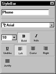
StyleBar
The StyleBar includes buttons for applying properties (such
as bold) to selected text elements:
Using the Properties view in the DataWindow painter
Each part of the DataWindow object (such as text, columns, computed
fields, bands, graphs, even the DataWindow object itself) has a set of
properties appropriate to the part. The properties display in the
Properties view.
You can use the Properties view to modify the parts of the DataWindow object.
 To use the Properties view to modify the parts
of the DataWindow object:
-
Position the mouse over the part you want
to modify. -
Display the part’s popup menu and select
Properties.If it’s not already displayed, the Properties view
displays. In any case, the view displays the properties of the currently
selected control(s), band, or of the DataWindow object itself. The contents
of the Properties view changes as different controls are selected
(made current).
The following Properties view is for a column. It has seven
tabbed property pages of information, which you access by clicking
the appropriate tab. For example, if you want to choose an edit
style for the column, you click the Edit tab. This brings the Edit
property page to the front of the Properties view:
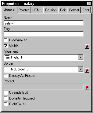
When you want to modify the properties of part of a DataWindow object, display
the Properties view and pick the properties you want to change.
Click the various tabs to change property pages.
Selecting controls in the DataWindow painter
The DataWindow painter provides several ways to select controls to
act on. You can select multiple controls and act on all the selected
controls as a unit. For example, you can move all of them or change
the fonts used to display text for all of them.
Lasso selection Use lasso selection when possible because
it’s fast and easy. Lasso selection is another name for
the method described below for selecting neighboring multiple controls.
To select one control in a DataWindow object in the Design
view:
-
Click it.
The control displays with handles on it. Previously selected
controls are no longer selected.
To select neighboring multiple controls in a DataWindow object in
the Design view (lasso selection):
-
Press and hold the left mouse button at
one corner of the neighboring controls. -
Drag the mouse over the controls you want to select.
A bounding box (the lasso) displays.
-
Release the mouse button.
All the controls in the bounding box are selected.
To select non-neighboring multiple controls in
a DataWindow object in the Design view:
- Click the first control.
-
Press and hold the ctrl key
and click additional controls.All the controls are selected.
To select controls by type or position in the DataWindow object:
-
Do the following:
To select Select this item from the menu bar All controls Edit>Select>Select
AllAll text Edit>Select>Select
TextAll columns Edit>Select>Select
ColumnsControls in relation to
the currently selected controlEdit>Select>Select
AboveEdit>Select>Select
BelowEdit>Select>Select
LeftEdit>Select>Select
Right
To select
controls in a DataWindow object in the Control List view:
-
Select View>Control List from
the menu bar. - Click a control in the list.
-
Press and hold the ctrl key
and click additional controls if desired.
Displaying information about the selected control
The name, x and y coordinates, width, and height of the selected
control are displayed in the MicroHelp bar. If multiple controls
are selected, Group Selected
displays in the
Name area and the coordinates and size do not display.
Resizing bands in the DataWindow painter Design view
You can change the size of any band in the DataWindow object.
To resize a band in the DataWindow painter Design view:
-
Position the pointer on the bar representing
the band and drag the bar up or down to shrink or enlarge the band.
Using zoom in the DataWindow painter
You can zoom the display in and out in four views in the DataWindow painter: the
Design view, Preview view, Data View, and Column Specifications
view. For example, if you are working with a large DataWindow object, you
can zoom out the Design view so you can see all of it on your screen.
Or you can zoom in on a group of controls to better see their details.
To zoom the display in the DataWindow painter:
-
Select the view you want to zoom (click
in the view). You can zoom the Design view, Preview view, Data View,
and Column Specifications view. - Select Design>Zoom from the menu bar.
-
Select a built-in zoom percentage.
or
Set a custom zoom percentage by typing an integer in
the Custom box.
Using the IntelliMouse pointing device Using the IntelliMouse pointing device, users can also zoom
a view larger or smaller by holding down the ctrl key
while rotating the wheel.
Undoing changes in the DataWindow painter
You can undo your change by pressing ctrl+z or
selecting Edit>Undo from the menu bar. Undo requests affect
all views.