TreeView presentation style
The TreeView presentation style provides an easy way to create DataWindow objects
that display hierarchical data in a TreeView, where the rows are
divided into groups that can be expanded and collapsed.
The TreeView DataWindow displays a hierarchy of nodes, similar
to the way:
-
The left pane of Windows Explorer
displays folders and files -
The PowerBuilder System Tree displays workspaces
and their contents
In the TreeView DataWindow, each parent node contains other
nodes called child nodes. You can display parent nodes—nodes
that contain child nodes—in expanded or collapsed form.
With the TreeView DataWindow presentation style, you can group
data in a hierarchy that allows users to browse the data and expand
nodes to view details. Each TreeView level or node has an icon that
users can click to expand or collapse the node.
You use the TreeView DataWindow wizard to create a TreeView DataWindow object.
For information, see “Creating a new TreeView DataWindow”.
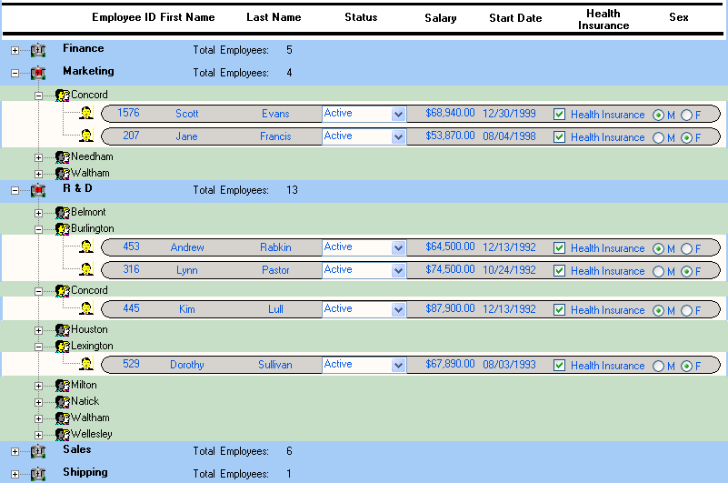
Example
This sample TreeView DataWindow uses the department and employee
tables in the EAS Demo DB database and has two TreeView levels.
The first level is the department name. The second level is the
city where each employee resides. The detail data for each employee
is grouped in TreeView leaf nodes under these two levels.
Similarities to the Group presentation style
Creating and using a TreeView DataWindow is similar to creating
and using a Group DataWindow. However, with the TreeView DataWindow,
you can click the state icon to expand and collapse nodes.
The state icon in a TreeView DataWindow is a plus sign (+)
when the node is collapsed and a minus sign (-) when the node is
expanded. When a node is expanded, connecting lines display by default
to show more detail and indicate how the parent data connects with
the child data. When a node is collapsed, only the parent data displays;
the detail data does not.