Defining the appearance of menu items
You can use the Menu painter to change the appearance and
behavior of your menu and menu items by choosing different settings
in the tabbed pages in the Properties view.
For a list of all menu item properties, see Objects
and Controls
.
| To do this | Choose this tab |
|---|---|
| Specify the name of the menu item along with its MicroHelp and tag |
General |
| Specify the type of menu item and whether it is checked, enabled, visible, shifted, or merged |
General |
| Specify a shortcut key for the menu item | General |
| Specify the toolbar entry for the menu item |
Toolbar |
| Associate a toolbar picture with the menu item |
Toolbar |
All of these properties are discussed in the sections that
follow.
Setting General
properties
When you select a menu item and then select the General tab
page in the Properties view, you can set a variety of general properties
for the selected menu item.
Unlocking menu item names
For information, see “How menu items
are named”.
Creating MicroHelp and tags
You can create MicroHelp Text and a tag for a menu item. MicroHelp
is a brief text description of the menu item that displays on the
status bar at the bottom of a Multiple Document Interface (MDI)
application window. You can quickly add MicroHelp text to any menu
item in your application. A tag is a text string that you can associate
with an object and use in any way you want.
 To create MicroHelp text:
- Select the General tab in the Properties view.
- Select the menu item for which you want to create MicroHelp.
- Enter the MicroHelp text in the MicroHelp edit control.
For information about defining MicroHelp text
and tag properties, see the chapter on building MDI applications
in Application Techniques
.
Setting the appearance
of a menu item
On the General tab page in the Properties view, you can also
specify how a menu item appears during execution.
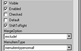
| Property | Meaning |
|---|---|
| Visible | Whether the menu item is visible. An invisible menu item still displays in the WYSIWYG and Tree Menu views, but during execution, it will not display. In WYSIWYG Menu view, an invisible item has faded and dotted text. |
| Enabled | Whether the menu item can be selected |
| Checked | Whether the menu item displays with a checkmark next to it |
| Default | Whether the menu item text is bold. In popup menu, Default indicates what action occurs if the user double-clicks instead of right-clicks on an item. In dragging, Default indicates what happens when an item is dragged with the left mouse button instead of the right-mouse button |
| ShiftToRight | Whether the menu item shifts to the right (or down for a dropdown or cascading menu) when you add menu items in a menu that is inherited from this menu. Selecting this property allows you to insert menu items in descendent menus, instead of only being able to add menu items to the end of menus in descendent menusFor more information, see “Inserting menu items in a descendent menu” |
| MergeOption | The way menus are modified when an OLE object is activated. Options are: File, Edit, Window, Help, Merge, ExcludeFor more information, see the chapter about using OLE in an application in Application Techniques |
| MenuItemType | Whether the menu item you are creating is Normal, About, Exit, or Help type |
The settings you specify here determine how the menu items
display by default. You can change the values of the properties
in scripts during execution.
Assigning
accelerator and shortcut keys
Every menu item should have an accelerator key,
also called a mnemonic access key, which allows users to select
the item from the keyboard by pressing ALT+key
when
the menu is displayed. Accelerator keys display with an underline
in the menu item text.
You can also define shortcut keys,
which are combinations of keys that a user can press to select a
menu item anytime.
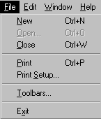
For example, in the following menu all menu items have accelerator
keys (New’s accelerator key is N, Open’s is O,
and so on). New, Open, Close, and Print each have shortcut keys
(the CTRL key in combination with another key or keys).
You should adopt conventions for using accelerator and shortcut
keys in your applications. All menu items should have accelerator
keys, and commonly used menu items should have shortcut keys.
If you specify the same shortcut for more than one MenuItem,
the command that occurs later in the menu hierarchy is executed.
To assign an accelerator key:
-
Type an ampersand (&) before the
letter in the menu item text that you want to designate as the accelerator
key.For example, &File designates the F in File as an
accelerator key and Ma&ximize designates the x in Maximize
as an accelerator key.
To assign a shortcut key:
-
Select the menu item you want to assign
a shortcut key to. - Select the General tab on the property sheet.
-
Select a key from the Key dropdown listbox.
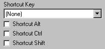
-
Select Shortcut Alt, Shortcut Ctrl, and/or
Shortcut Shift to create a key combination.PowerBuilder displays the shortcut key next to the menu item
name.
Setting toolbar and picture properties
In an MDI application you can associate a menu item with a
button on a toolbar by performing two steps:
- Associate the menu
item with a toolbar button - Associate the toolbar button with a picture
You can specify whether the toolbar button will be visible
on the toolbar, its placement on the toolbar, and the pictures it
will use. You can also specify different pictures for the toolbar
button up and down states.
To associate a menu item with a toolbar button
and picture:
-
Select the Toolbar tab on the Menu painter property
sheet.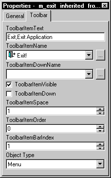
-
Enter the following information:
In this box Do this ToolBarItemText Enter the descriptive text for the toolbar
button. This text displays in the toolbar item when the application
is running if the display text option is on for toolbarsToolBarItemName Enter the name of the picture you want
to associate with the toolbar button’s normal state by
selecting a stock picture or using the Browse button to associate
a cursor, bitmap, or icon fileToolBarItemDownName Enter the name of the picture you want
to associate with the toolbar button’s normal state by
selecting a stock picture or using the Browse button to associate
a cursor, bitmap, or icon fileToolBarItemVisible If you want the toolbar button to be
visible, select the checkboxToolBarItemDown If you want the toolbar button to appear
pressed, select the checkboxToolBarItemSpace Specify the amount of space you want
before the button in the toolbarToolBarItemOrder Specify the order for the button in the
toolbar by entering a number. The default is to display buttons in
the same order as in the menuToolBarItemBarIndex Specify the number of the toolbar in
which you want the toolbar button to appearObjectType Select Menu or MenuCascade to specify
the type of menu item the toolbar button is associated withColumns (This property only displays if you choose MenuCascade
in the ObjectType dropdown listbox) Indicate the number of columns
you want to display in the cascading toolbarDrop Down (This property only displays if you choose MenuCascade
in the ObjectType dropdown listbox) If you want the button to be
a DropDown toolbar button, select the checkbox
For information about defining toolbars and
picture properties, see the chapter on building MDI applications
in Application Techniques
.