Defining edit styles
This section describes how to specify each type of edit style.
The Edit edit style
By default, columns use the Edit edit style, which displays
data in an edit control. You can customize the appearance and behavior
of the edit control by modifying a column’s Edit edit style.
To do so, select Edit in the Style Type drop-down
list and specify the properties for that style:
- To restrict the number of characters users can
enter, enter a value in the Limit box. - To convert the case of characters upon display,
enter an appropriate value in the Case box. - To have entered values display as asterisks for
sensitive data, check the Password box. - To allow users to tab to the column but not
change the value, check the Display Only box. - To define a code table to determine which values
are displayed to users and which values are stored in the database, check
the Use Code Table box and enter display and data values for the
code table.
See “Defining a code table”.
 To use the Edit edit style:
-
Select Edit from the Style Type list, if
it is not already selected. -
Select the properties you want.
 Date columns and regional settings Using the Edit edit style, or no edit style, with a date column
can cause serious data entry and validation problems if a user’s
computer is set up to use a nonstandard date style, such as yyyy/dd/mm.
For example, if you enter 2001/03/05 in the Retrieval
Arguments dialog box for a date column when the mask is yyyy/dd/mm,
the date is interpreted as March 5 instead of May 3. To ensure that
the order of the day and month is interpreted correctly, use an EditMask
edit style.
The DropDownListBox edit style
You can use the DropDownListBox edit style to have columns
display as drop-down lists at runtime:
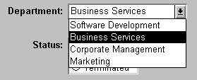
Typically, this edit style is used with code tables, where
you can specify display values (which users see) and shorter
data values (which are stored in the database).
In the DropDownListBox edit style, the display values of the
code table display in the ListBox portion of the DropDownListBox. The
data values are the values that are put in the DataWindow buffer
(and sent to the database when an Update is issued) when the user
selects an item in the ListBox portion of the drop-down list.
In the preceding example, when users see the value Business
Services, the corresponding data value could be 200.
To use the DropDownListBox edit style:
-
Select DropDownListBox from the Style Type list.
-
Select the appropriate properties.
-
Enter the value you want to have appear in the
Display Value box and the corresponding data value in the Data Value
box.
At runtime
You can define and modify a code table for a column in a script by
using the SetValue method at runtime. To obtain
the value of a column at runtime, use the GetValue method.
To clear the code table of values, use the ClearValues method.
For more about code tables, see “Defining a code table”.
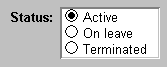
The CheckBox edit style
If a column can take only one of two (or perhaps three) values,
you might want to display the column as a check box; users can
select or clear the check box to specify a value. In the following
entry from a DataWindow object, users can simply check or clear a
box to indicate whether an employee has health insurance:

To use the CheckBox edit style:
-
Select CheckBox from the Style Type list
and specify properties for that style. -
In the Text box, enter the text you want displayed next
to the check box. Using accelerator keys If the CheckBox has an accelerator key, enter an ampersand
(&) before the letter in the text that represents the accelerator
key. -
In the Data Value For boxes, enter the values you want put
in the DataWindow buffer when the CheckBox is checked (on) or unchecked (off).If you selected the 3 States box, an optional third state
box (other) appears, for the case when the condition is neither
on nor off.
What happens
The value you enter in the Text box becomes the display value,
and values entered for On, Off, and Other become the data values.
When users check or clear the check box at runtime, PowerBuilder enters
the appropriate data value in its buffer. When the Update method
is called, PowerBuilder sends the corresponding data values to the
database.
Centering check boxes without text
You may find it useful to center check boxes used for columns
of information. First make the text control used for the column
header and the column control the same size and left aligned. Then
you can center the check boxes and the column header.
To center check boxes without text:
-
In the Edit property page for the column,
make sure the Left Text check box is not selected and that the Text
box where you specify associated text is empty. -
In the General property page, specify centering
(Alignment>Center) or specify centering using the StyleBar.
The RadioButtons edit style
If a column can take one of a small number of values, you
might want to display the column as radio buttons:
To use the RadioButtons edit style:
-
Select RadioButtons from the Style Type list
and specify properties for that style. -
Specify how many radio buttons will display in
the Columns Across box. -
Eenter a set of display and data values for each
button you want to display.The display values you enter become the text of the buttons;
the data values are put in the DataWindow buffer when the button
is clicked. Using accelerator keys To use an accelerator key on a radio button, enter an ampersand
(&) in the Display Value before the letter that will be
the accelerator key.
What happens
Users select values by clicking a radio button. When the Update method
is issued, the data values are sent to the database.
The EditMask edit style
Sometimes users need to enter data that has a fixed format.
For example, in North America phone numbers have a 3-digit area
code, followed by three digits, followed by four digits. You can
define an edit mask that specifies the format to make it easier
for users to enter values:

Edit masks consist of special characters that determine what
can be entered in the column. They can also contain punctuation
characters to aid users.
For example, to make it easier for users to enter phone
numbers in the proper format, specify this mask:
|
1 |
(###) ###-#### |
At runtime, the punctuation characters display in the box
and the cursor jumps over them as the user types:

Special characters and keywords
Most edit masks use the same special characters as display
formats, and there are special considerations for using numeric,
string, date, and time masks. For information, see “Defining display formats”.
The special characters you can use in string edit masks are
different from those you can use in string display formats.
| Character | Meaning |
|---|---|
| ! | Uppercase – displays all characters with letters in uppercase |
| ^ | Lowercase – displays all characters with letters in lowercase |
| # | Number – displays only numbers |
| a | Alphanumeric – displays only letters and numbers |
| X | Any character – displays all characters |
If you use the “#” or “a” special
characters in a mask, Unicode characters, spaces, and other characters
that are not alphanumeric do not display.
Semicolons invalid in EditMask edit styles In a display format, you can use semicolons to separate sections
in number, date, time, and string formats. You cannot use semicolons
in an EditMask edit style.
Keyboard behavior
Note the following about how certain keystrokes behave in
edit masks:
- Both Backspace
and Shift + Backspace delete the preceding character. - Delete deletes everything that is selected.
- Non-numeric edit masks treat any characters that
do not match the mask pattern as delimiters.
Also, note certain behavior in Date edit masks:
- Entering zero for the day
or month causes the next valid date to be entered. For example,
if the edit mask is DD/MM/YY, typing 00/11/01 results
in 01/11/01.
You can override this behavior in the development environment by
adding the following lines to your PB.INI file:1[Edit Mask Behaviors]<br />AutocompleteDates=noFor deployed applications, the date is completed automatically
unless you provide a file called PB.INI in
the same directory as the executable file that contains these lines.
Note that this section must be in a file called PB.INI. Adding
the section to a different INI file shipped with the application
will have no effect. - You cannot use a partial mask, such as dd or mmm,
in a date edit mask. Any mask that does not include any characters
representing the year will be replaced by a mask that does. - The strings 00/00/00 or 00/00/0000
are interpreted as the NULL value for the column.
Using the Mask pop-up menu
Click the button to the right of the Mask box on the Mask
property page to display a list that contains complete masks that
you can click to add to the mask box, as well as special characters
that you can use to construct your own mask. For example, the menu
for a Date edit mask contains complete masks such as mm/dd/yy
and dd/mmm/yyyy. It also has components such as
dd and jjj (for a Julian day). You might use these to construct
a mask like dd-mm-yy, typing in the hyphens as separators.
Using masks with “as is” characters
You can define a mask that contains “as is” characters
that always appear in the control or column. For example, you might
define a numeric mask such as Rs0000.00 to
represent Indian rupees in a currency column.
However, you cannot enter a minus sign to represent negative
numbers in a mask that contains “as is” characters,
and the # special character is treated as a 0 character.
As a result, if you specify a mask such as ###,##0.00EUR,
a value such as 45,000 Euros would display with a leading zero:
045,000.00EUR. Note that you must always specify a mask that has
enough characters to display all possible data values. If the mask
does not have enough characters, for example if the mask is #,##0.00
and the value is 45000, the result is unpredictable.
The preferred method of creating a currency editmask is to
use the predefined [currency(7)] –
International mask. You can change the number
in parentheses, which is the number of characters in the mask including
two decimal places. When you use this mask, PowerBuilder uses the
currency symbol and format defined in the regional settings section
of the Windows control panel. You can enter negative values in a
column that uses a currency mask.
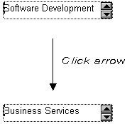
Using spin controls
You can define an edit mask as a spin control, a box that
contains up and down arrows that users can click to cycle through
fixed values. For example, you can set up a code table that provides
the valid entries in a column; users simply click an arrow
to select an entry. Used this way, a spin control works like a drop-down
list that displays one value at a time:
For more about code tables, see “Defining a code table”.
To use an EditMask edit style:
-
Select EditMask in the Style Type box if it is
not already selected. -
Define the mask in the Mask box. Click the special characters
in the pop-up menu to use them in the mask. To display
the pop-up menu, click the button to the right of the Mask box. -
Specify other properties for the edit mask.
When you use your EditMask, check its appearance and behavior.
If characters do not appear as you expect, you might want to change
the font size or the size of the EditMask.
Using a drop-down calendar
You can use a drop-down calendar option on any DataWindow column
with an EditMask edit style and a Date, DateTime, or TimeStamp datatype.
The DDCalendar EditMask property allows for separate selections
of the calendar month, year, and date. This option can be set in
a check box on the Edit page of the DataWindow painter Properties view when
a column with the EditMask edit style is selected. It can also be
set in code, as in this example for the birth_date column:
|
1 |
dw1.Modify("birth_date.EditMask.DDCalendar='Yes'") |
If you do not include script for client formatting in a Web
DataWindow, the drop-down calendar uses a default edit
mask to display the column data based on the client computer’s
default localization settings. To make sure that dates selected
with the drop-down calendar option are displayed with the
desired edit mask, specify that the Client Formatting option be
included with the static JavaScript generated and deployed for the
DataWindow.
To conserve bandwidth, JavaScript for client formatting is
not included by default. To include this script, select the Client Formatting check
box on the Web Generation tab of the DataWindow Properties view.
The drop-down calendar option is supported in all Web DataWindow
rendering formats (HTML, XHTML, and XML).
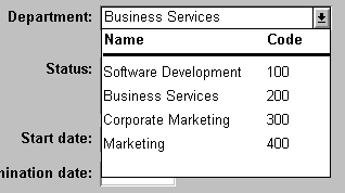
The DropDownDataWindow edit style
Sometimes another data source determines which data is valid
for a column.
Consider this situation: the Department table
includes two columns, Dept_id and Dept_name,
to record your company’s departments. The Employee table records
your employees. The Department column in the Employee table
can have any of the values in the Dept_id column
in the Department table.
As new departments are added to your company, you want the DataWindow object containing
the Employee table to automatically provide
the new departments as choices when users enter values in the Department column.
In situations such as these, you can specify the DropDownDataWindow
edit style for a column: it is populated from another DataWindow object.
When users go to the column, the contents of the DropDownDataWindow
display, showing the latest data:
To use the DropDownDataWindow edit style:
-
Create a DataWindow object that contains the columns
in the detail band whose values you want to use in the column.You will often choose at least two columns: one column that
contains values that the user sees and another column that contains
values to be stored in the database. In the example above, you would
create a DataWindow object containing the dept_id and dept_name columns
in the Department table. Assume this DataWindow object is
named d_dddw_dept. -
For the column in a second DataWindow getting its data
from the d_dddw_dept DataWindow object,
select the DropDownDW edit style.In the example, you would specify the DropDownDataWindow edit
style for the dept_id column that
you want to display with the department name as well as the department
ID: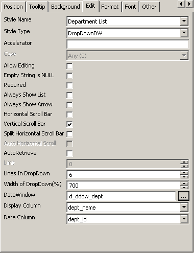
-
Click the browse button next to the DataWindow box and
select the DataWindow object that contains the data for the column from
the list (in the example, d_dddw_dept).
The list includes all the DataWindow objects in the current target. -
In the Display Column box, select the column containing
the values that will display in the DataWindow object (in the example, dept_name). -
In the Data Column box, select the column containing
the values that will be stored in the database (in the example, dept_id). -
Specify other properties for the edit style.
What happens
At runtime, when data is retrieved into the DataWindow object, the
column whose edit style is DropDownDataWindow will itself be populated
as data is retrieved into the DataWindow object serving as the drop-down DataWindow object.
When the user goes to the column and drops it down, the contents
of the drop-down DataWindow object display. When the user selects
a display value, the corresponding data value is stored in the DataWindow
buffer and is stored in the database when an Update is
issued.
Limit on size of data value The data value for a column that uses the DropDownDataWindow
edit style is limited to 511 characters.
The RichText edit style
You can use the RichText edit style to display column data
in a rich text format, and to use different fonts and colors in
the same data field.
Columns that you format with the RichText edit style require
considerably more storage space than columns with plain text edit
styles. Therefore you should set a minimum of 1 KB for the column
width. Otherwise, you can use the RichText edit style with columns
that have large text datatypes.
By default, whenever a column with the RichText edit style
is edited in the Preview view or at runtime, a font toolbar displays.
The font toolbar disappears when the column loses focus. The following
picture shows the default font toolbar available for columns with
the RichText edit style:

You can modify the RichTextToolbarActivation constant on a DataWindow control to
display the font toolbar whenever a DataWindow object containing columns
with the RichText edit style has focus—whether or not this
type of column is selected. You can also modify the constant so
that the font toolbar never appears.
For more information, see RichTextToolbarActivation in the
online Help.
The RichText edit style is not available for columns in a DataWindow object with
the Graph, OLE, or RichText presentation styles.
The InkEdit edit style
The InkEdit edit style is designed for use on a Tablet PC
and provides the ability to capture ink input from users of Tablet
PCs.
You can specify InkEdit as a style type on the Edit page in
the Properties view for columns. When the column gets focus, an
InkEdit control displays so that the user can enter text with the
stylus or mouse. The text is recognized and displayed, then sent
back to the database when the column loses focus.
The InkEdit edit style is fully functional on Tablet PCs.
On other computers, it behaves like the Edit edit style.
For more information about ink controls and the Tablet PC,
and to download the Tablet PC SDK, go to the Microsoft Tablet PC Web site
.