Defining a graph’s properties
This section describes properties of a graph that are used
regardless of whether the graph is in a DataWindow object or in a window.
To define the properties of a graph, you use the graph’s
Properties view.
For general information about the property
pages, see “Using the graph’s
Properties view”.
Using the General property page in the graph’s Properties view
One of the first things you will probably do with a graph
is name it and define its basic properties. You can do that on the
General property page in the graph’s Properties view.
![]() To specify the basic properties of a graph:
To specify the basic properties of a graph:
-
Select Properties from the graph’s
popup menu and then select the General page in the Properties view:
About the model graph in the Design view
As you modify your graph’s properties, PowerBuilder updates
the model graph shown in the Design view so you can get an idea
of the graph’s basic layout:
- PowerBuilder uses the graph title and axis labels you specify.
- PowerBuilder uses sample data (not data from your DataWindow object) to
illustrate series, categories, and values.
In Preview view, PowerBuilder displays the graph with data.
Naming a graph
You can modify graphs in scripts during execution. To reference
a graph during execution, you use its name.
![]() To name a graph:
To name a graph:
-
On the General properties page for the
graph, assign a meaningful name to the graph in the Name box.
Defining a graph’s title
The title displays at the top of the graph.
![]() To specify a graph’s title:
To specify a graph’s title:
-
On the General properties page for the
graph, enter a title in the Title box.
![]() Multiline titles You can force a new line in a title by embedding ~n.
Multiline titles You can force a new line in a title by embedding ~n.
For information about specifying properties
for the title text, see “Specifying text properties
for titles, labels, axes, and legends”.
Specifying the type of graph
You can change the graph type anytime in the development
environment. (To change the type during execution, modify a graph’s
GraphType property.)
![]() To specify the graph type:
To specify the graph type:
-
On the General properties page for the
graph, select a graph type from the Graph Type dropdown listbox.
Using legends
A legend provides a key to your graph’s series.
![]() To include a legend for a series in a graph:
To include a legend for a series in a graph:
-
On the General properties page for the
graph, specify where you want the legend to appear by selecting
a value in the Legend dropdown listbox.
For information on specifying text properties
for the legend, see “Specifying text properties
for titles, labels, axes, and legends”.
Specifying a border
You can specify the border that PowerBuilder places around a
graph.
![]() To specify a border for a graph:
To specify a border for a graph:
-
On the General properties page for the
graph, select the type of border to use from the Border dropdown
listbox.
Specifying point of view in 3D graphs
If you are defining a 3D graph, you can specify the point
of view that PowerBuilder uses when displaying the graph.
![]() To specify a 3D graph’s point of view:
To specify a 3D graph’s point of view:
-
On the General properties page for the
graph, adjust the point of view along the three dimensions of the
graph:- To change the perspective,
move the Perspective slider. - To rotate the graph, move the Rotation slider.
- To change the elevation, move the Elevation slider.
- To change the perspective,
-
Define the depth of the graph (the percent the
depth is of the width of the graph) by using the Depth slider.
Sorting data for series and categories
You can specify how to sort the data for series and categories.
By default, the data is sorted in ascending order.
![]() To specify how to sort the data for series and
To specify how to sort the data for series and
categories in a graph:
-
Select Properties from the graph’s
popup menu and then select the Axispage in the Properties view.
-
Select the axis for which you want to specify
sorting. -
Scroll to Sort, the last option on the Axis page,
and select Ascending (order), Descending (order), or Unsorted.
Specifying text properties for titles, labels, axes, and legends
A graph can have four text elements:
- Title
- Labels for the axes
- Text that shows the values along the axes
- Legend
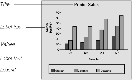
You can specify properties for each text element.
![]() To specify text properties for the title, labels,
To specify text properties for the title, labels,
axes values, and legend of a graph:
-
Select Properties from the graph’s
popup menu and then select the Text page in the Properties view. -
Select a text element from the list in the Text
Object dropdown listbox: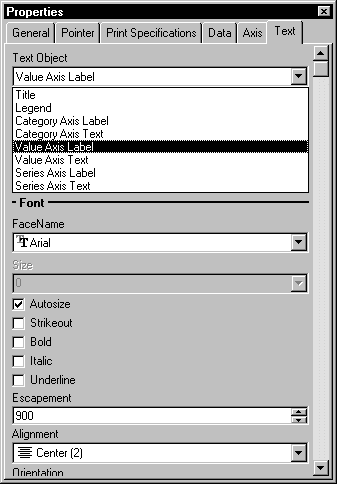
- Specify the font and its characteristics.
Using Auto Size
With Auto Size in effect, PowerBuilder resizes the text appropriately
whenever the graph is resized. With Auto Size disabled, you specify
the font size of a text element explicitly.
![]() To have PowerBuilder automatically size a text element
To have PowerBuilder automatically size a text element
in a graph:
-
On the Text properties page for the graph,
select a text element from the list in the Text Object dropdown
listbox. - Select the Autosize checkbox (this is the default).
![]() To specify a font size for a text element in a
To specify a font size for a text element in a
graph:
-
On the Text properties page for the graph,
select a text element from the list in the Text Object dropdown
listbox. - Deselect the Autosize checkbox.
- Select the Font size in the Size dropdown listbox.
Rotating text
For all the text elements, you can specify the number of degrees
by which you want to rotate the text.
![]() To specify rotation for a text element in a graph:
To specify rotation for a text element in a graph:
-
On the Text properties page for the graph,
select a text element from the list in the Text Object dropdown
listbox. -
Specify the rotation you want in the Escapement
box using tenths of a degree (450 means 45 degrees)
Changes you make here are shown in the model graph in the
Design view and in the Preview view.
Using display formats
![]() To use a display format for a text element in
To use a display format for a text element in
a graph:
-
On the Text properties page for the graph,
select a text element from the list in the Text Object dropdown
listbox. -
Type a display format in the Format box or choose
one from the popup menu. To display the popup menu, click the button
to the right of the Format box.
Modifying display expressions
You can specify an expression for the text that is used for
each graph element. The expression is evaluated at execution time.
![]() To specify an expression for a text element in
To specify an expression for a text element in
a graph:
-
On the Text properties page for the graph,
select a text element from the list in the Text Object dropdown
listbox. -
Click the button next to the Display Expression
box.The Modify Expression dialog box displays:
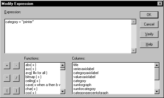
-
Specify the expression.
You can paste functions, column names, and operators. Included
with column names in the Columns box are statistics about the columns,
such as counts and sums. -
Click OK to return to the graph’s Properties
view.
Example
Here’s an example of using expressions to enhance
a graph.
By default, when you generate a pie graph, PowerBuilder puts
the title at the top and labels each slice of the pie with the percentage
each slice is of the whole. Percentages are accurate to two decimal
places.
The following graph has been enhanced as follows:
- The current date displays
in the title - The percentages are rounded to integers
- The raw data for each slice is shown in addition
to the percentages
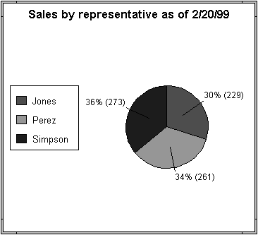
To accomplish this, the display expressions were modified
for the title and pie graph labels:
| Text element | Original expression | Modified expression |
|---|---|---|
| Title | title | title + ” as of ” + date(today()) |
| Pie graph labels | if(seriescount > 1, series, string(percentofseries, “0.00%”)) | if(seriescount > 1, series, string(percentofseries,”0%”) + ” (” + value + “)” ) |
Specifying overlap and spacing
With bar and column charts, you can specify the following
properties:
| Property | Meaning |
|---|---|
| Overlap | The percentage by which bars or columns overlap each other. The default is 0 percent, meaning no overlap |
| Spacing | The amount of space to leave between bars or columns. The default is 100 percent, which leaves a space equal to the width of a bar or column |
![]() To specify overlap and spacing for the bars or
To specify overlap and spacing for the bars or
columns in a graph:
-
Select Properties from the graph’s
popup menu and then select the Graph tab. -
Specify a percentage for Overlap (% of
width) and Spacing (% of width).
Specifying axis properties
Graphs have two or three axes. You specify the axes’ properties
in the Axis page in the graph’s Properties view.
![]() To specify properties for an axis of a graph:
To specify properties for an axis of a graph:
-
Select Properties from the graph’s
popup menu and then select the Axis page in the Properties view. -
Select the Category, the Value, or the Series
axis from the Axis dropdown listbox.If you are not working with a 3D graph, the Series Axis options
are disabled. - Specify the properties as described next.
Specifying text properties
You can specify the characteristics of text that displays
for each axis. There are two kinds of text associated with an axis:
| Type of text | Meaning |
|---|---|
| Text | Text that identifies the values for an axis |
| Label | Text that describes the axis. You specify the label text in a painter. You can use ~n to embed a new line within a label |
For information on specifying properties for
the text, see “Specifying text properties
for titles, labels, axes, and legends”.
Specifying data types
The data graphed along the Value, Category, and Series axes
has an assigned data type. The Series axis always has the data type
String. The Value and Category axes can have the following data
types:
| Axis | Possible data types |
|---|---|
| Both axes (for scatter graph) | Number, Date, Time |
| Value (other graph types) | Number, Date, DateTime, Time |
| Category (other graph types) | String, Number, Date, DateTime, Time |
For graphs in DataWindow objects, PowerBuilder automatically assigns
the data types based on the data type of the corresponding column;
you do not specify them.
For graphs in windows, you specify the data types yourself.
Be sure you specify the appropriate data types, so when you populate
the graph (using the AddData function), the data matches the data
type.
Scaling axes
You can specify several properties that define the scaling
used along numeric axes:
| Property | Meaning |
|---|---|
| Autoscale | If selected (the default), PowerBuilder automatically assigns a scaling for the numbers along the axis |
| Round To, Round To Unit | Specifies how to round the end points of the axis (note that this just rounds the range displayed along the axis; it doesn’t round the data itself)You can specify a number and a unit. The unit is based on the data type; you can specify Default as the unit to have PowerBuilder decide for youFor example, if the Value axis is a Date column, you can specify that you want to round the end points of the axis to the nearest five years. In this case, if the largest data value is the year 1993, the axis will extend up to 1995, which is 1993 rounded to the next highest five-year interval |
| Minimum Value, Maximum Value | The smallest and largest numbers to appear on the axis (disabled if you have selected Autoscale) |
| Scale Type | Specifies linear or logarithmic scaling (common or natural) |
Using major and minor divisions
You can divide axes into divisions. Each division is identified
by a tick mark, which is a short line that intersects an axis. The
following graph’s Value axis is divided into two major
divisions. One goes from 0 to 100. The other goes from 100 to 200:
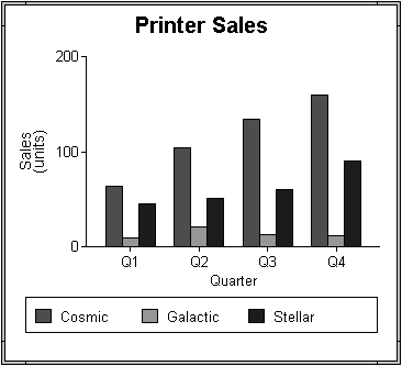
By default, PowerBuilder divides the axes automatically into
major divisions.
![]() To define divisions for an axis of a graph:
To define divisions for an axis of a graph:
-
To divide an axis into a specific number
of major divisions, type the number of divisions you want in the
MajorDivisions box.Leave the number 0 to have PowerBuilder automatically create
divisions.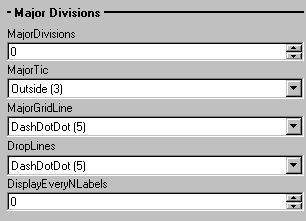
By default, PowerBuilder labels each tick mark in major divisions.
If you don’t want each tick mark labeled, enter a value
in the DisplayEveryNLabels box. For example, if you enter 2, PowerBuilder will label
every second tick mark for the major divisions. -
To use minor divisions, which are divisions within
each major division, type the appropriate number in the MinorDivisions
box. To not use minor divisions, leave the number 0: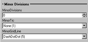
 When using logarithmic axes If you want minor divisions, specify 1; otherwise, specify
0.
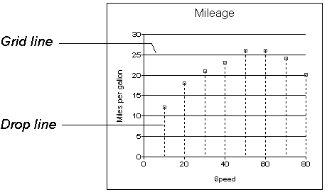
Specifying division lines You can specify lines to represent the divisions:
| Line | Meaning |
|---|---|
| Grid line | A line that extends from a tick mark across the graph. Grid lines make graphs easier to read |
| Drop line | A line that extends vertically from a data point to its axis (not available for all graph types) |
Using line styles
You can define line styles for the following components of
an axis:
| Component | Meaning |
|---|---|
| PrimaryLine | The axis itself |
| SecondaryLine | The axis parallel to and opposite the primary axis |
| OriginLine | A grid line that represents the value zero |
| Frame | The frame for the axis in 3D graphs (disabled for 2D graphs) |
Specifying a pointer
You can specify a pointer to use when the mouse is over a
graph during execution.
![]() To specify a pointer for a graph:
To specify a pointer for a graph:
-
Select Properties from the graph’s
popup menu and then select the Pointer page in the Properties view. -
Select a stock pointer from the list, or select
a CUR file containing a pointer.