Choosing a presentation style
The presentation style you select for a DataWindow object determines
the format PowerBuilder uses to display the DataWindow object in the Design view.
You can use the format as displayed or modify it to meet your needs.
When you create a DataWindow object, you can choose from the presentation styles
listed in the following table.
| Using this DataWindow wizard | You create a new DataWindow object |
|---|---|
| Composite | That includes other DataWindow objects |
| Crosstab | With summary data in a spreadsheet-like grid |
| Freeform | With the data columns going down the page and labels next to each column |
| Graph | With data displayed in a graph |
| Grid | With data in row and column format with grid lines separating rows and columns |
| Group | With data in rows that are divided into groups |
| Label | That presents data as labels |
| N-Up | With two or more rows of data next to each other |
| OLE 2.0 | That is a single OLE object |
| RichText | That combines input fields that represent database columns with formatted text |
| Tabular | With data columns going across the page and headers above each column |
| TreeView | With data grouped in rows in a TreeView; the TreeView displays the data hierarchically in a way that allows you to expand and collapse it |
Using the Tabular style
The Tabular presentation style presents data with the data
columns going across the page and headers above each column. As
many rows from the database will display at one time as can fit
in the DataWindow object. You can reorganize the default layout any way
you want by moving columns and text:

Using the Freeform style
The Freeform presentation style presents data with the data
columns going down the page and labels next to each column. You
can reorganize the default layout any way you want by moving columns
and text. The Freeform style is often used for data entry forms.

Using the Grid style
The Grid presentation style shows data in row-and-column format
with grid lines separating rows and columns. With other styles,
you can move text, values, and other objects around freely in designing
the report. With the grid style, the grid lines create a rigid structure
of cells.
An advantage of the Grid style is that users can reorder
and resize columns at runtime.
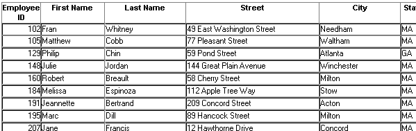
Original Grid report
This grid report shows employee information. Several of the
columns have a large amount of extra white space:
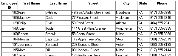
Grid report with modified column widths
This grid report was created from the original one by decreasing
the width of some columns:
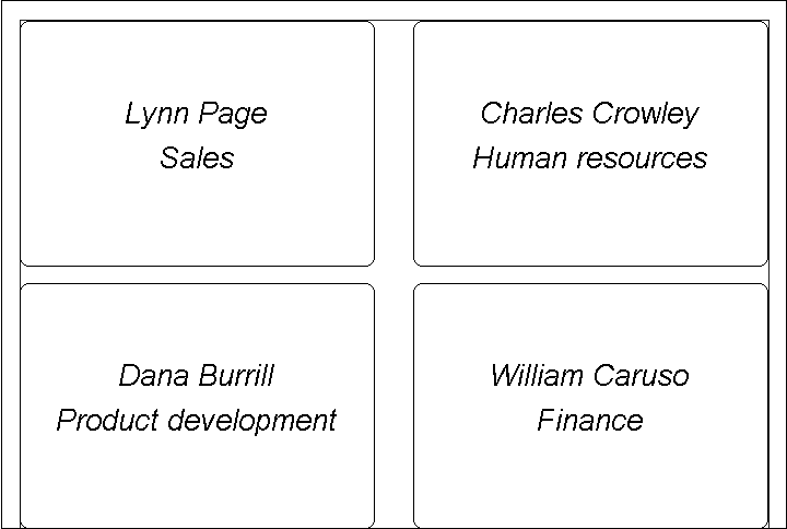
Using the Label style
The Label presentation style shows data as labels. With this
style you can create mailing labels, business cards, name tags,
index cards, diskette labels, file folder labels, and many other
types of labels.
Mailing labels

Business
cards

Name tags
Specifying label properties
If you choose the Label style, you are asked to specify the
properties for the label after specifying the data source. You can
choose from a list of predefined label types or enter your own specifications
manually.
Where label definitions come from
PowerBuilder gets the information about the predefined label
formats from a preferences file called PBLAB105.INI.
Using the N-Up style
The N-Up style presents two or more rows of data next to each
other. It is similar to the Label style in that you can have information
from several rows in the database across the page. However, the
information is not meant to be printed on labels. The N-Up presentation
style is useful if you have periodic data; you can set it up so
that each period repeats in a row.
After you select a data source, you are asked how many rows
to display across the page.
For each column in the data source, PowerBuilder defines n columns
in the DataWindow object (column_1 to column_n),
where n is the number of rows you specified.
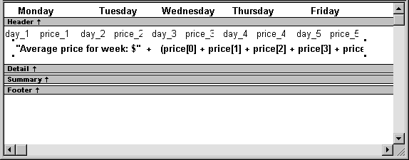
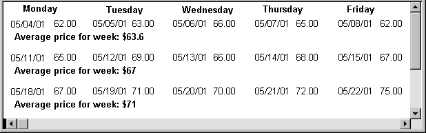
Table example
For a table of daily stock prices, you can define the DataWindow object as
five across, so each row in the DataWindow object displays five days’ prices (Monday
through Friday). Suppose you have a table with two columns, day and price,
that record the closing stock price each day for three weeks.
In the following n-up DataWindow object, 5 was selected as the number
of rows to display across the page, so each line in the DataWindow object shows five
days’ stock prices. A computed field was added to get the
average closing price in the week:
![]() About computed fields in n-up DataWindow objects You use subscripts, such as price[0], to
About computed fields in n-up DataWindow objects You use subscripts, such as price[0], to
refer to particular rows in the detail band in n-up DataWindow objects.
For more information, see Chapter 19, “Enhancing DataWindow Objects .”
Here is the DataWindow object in the Preview view:
![]() Another way to get multiple-column DataWindow objects In an n-up DataWindow object, the data is displayed across
Another way to get multiple-column DataWindow objects In an n-up DataWindow object, the data is displayed across
and then down. If you want your data to go down the page and then
across in multiple columns, as in a phone list, you should create
a standard tabular DataWindow object, then specify newspaper columns.
For more information on newspaper columns,
see Chapter 19, “Enhancing DataWindow Objects .”
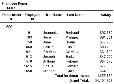
Using the Group style
The Group presentation style provides an easy way to create
grouped DataWindow objects, where the rows are divided into groups, each
of which can have statistics calculated for it. Using this style
generates a tabular DataWindow object that has grouping properties defined.
This Group style report groups by department and lists employees
and salaries. It also includes a subtotal and a grand total for
the salary column:
For more about the Group presentation style,
see Chapter 23, “Filtering, Sorting, and
Grouping Rows .”
Using the Composite style
The Composite presentation style allows you to combine multiple DataWindow objects
in the same object. It is particularly handy if you want to print
more than one DataWindow object on a page.
This composite report consists of three nested tabular reports.
One of the tabular reports includes a graph:

For more about the Composite presentation
style, see Chapter 25, “Using Nested Reports .”
Using the Graph and Crosstab styles
In addition to the (preceding) text-based presentation styles, PowerBuilder provides
two styles that allow you to display information graphically: Graph and
Crosstab.
There is a graph report in the composite report in “Using the Composite style”. This crosstab
report counts the number of employees that fit into each cell. For
example, there are three employees in department 100 who make between $30,000
and $39,999:

For more information about these two presentation
styles, see Chapter 26, “Working with Graphs ,” and Chapter 27, “Working with Crosstabs .”
Using the OLE 2.0 style
The OLE presentation style lets you link or embed an OLE object
in a DataWindow object.
For information about the OLE 2.0 presentation
style, see Chapter 31, “Using OLE in a DataWindow Object .”
Using the RichText style
The RichText presentation style lets you combine input fields
that represent database columns with formatted text.
For more information about the RichText presentation
style, see Chapter 30, “Working with Rich Text .”
Using the TreeView style
The TreeView presentation style provides an easy way to create DataWindow objects
that display hierarchical data in a TreeView, where the rows are
divided into groups that can be expanded and collapsed. Icons (+ or –)
show whether the state of a group in the TreeView is expanded or
collapsed, and lines connect parents and their children.
This TreeView style report groups by manager ID and state
and lists employee information and salaries:

For more about the TreeView presentation style,
see Chapter 28, “Working with TreeViews.”