About reports
Reports provide many ways for you to present data. You may
want a tabular report with rows and columns of information. Sometimes
a graph or a crosstab is a better way to present the data.
A PowerBuilder report can also be mailing labels or many reports
nested together on the same page. Freeform PowerBuilder reports let
you place text, data, lines, boxes, and pictures anywhere you want.
This means you can be very creative.
![]() Reports versus DataWindow objects Reports and DataWindow objects are the same objects. When
Reports versus DataWindow objects Reports and DataWindow objects are the same objects. When
you create a report, you are actually creating a DataWindow object
that you can open and modify in the DataWindow painter. However
a report is not updatable and can only be used to present data.
Report examples
Following are sample PowerBuilder reports that use data from
the EAS Demo DB.
Tabular report
The tabular report is the most common kind of report. You
use it for presenting information in rows and columns. This is a
basic tabular report:
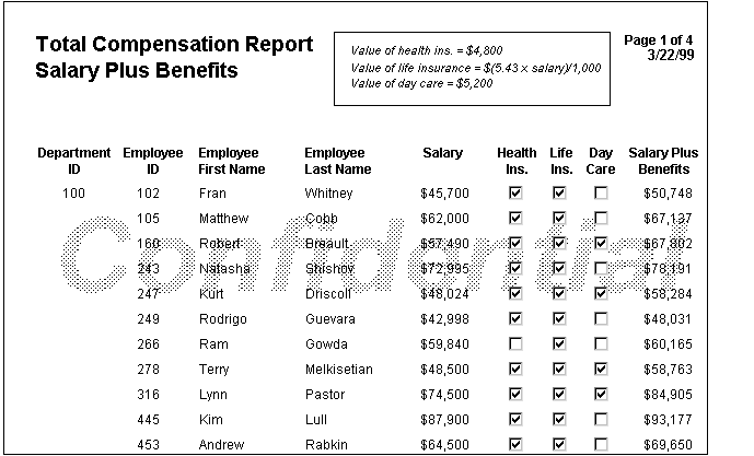
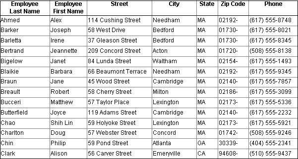
A more advanced tabular report
This tabular report includes a column computed from other
columns (Salary Plus Benefits) and special enhancements such as
the Confidential
watermark:
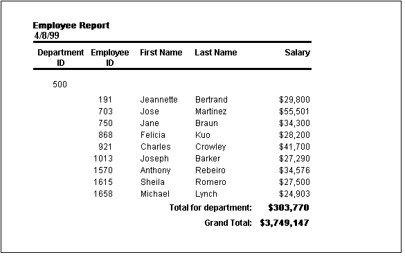
Grouped report
This Group style report groups by department and lists employees
and salaries. It also includes a subtotal and a grand total for
the salary column:
Grid report
This grid report looks very much like a tabular report. However,
the grid is a rigid structure of rows and columns. You can change
the column width and reorder the columns while you are viewing retrieved
data. The grid report is useful for ad hoc reporting:
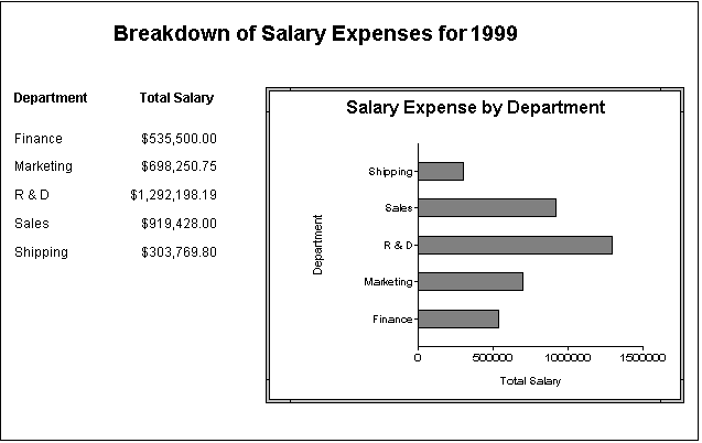
Report and graph
This report lists the salary totals by department. The graph
presents the same data in a visual way, which makes it easier to
see the relative cost of personnel in the five departments:
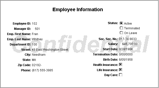
Freeform report
This freeform report presents all of the information about
employees, one at a time. You can move the information around easily
until you get what you want. The bitmap in the background marks
the information as confidential:
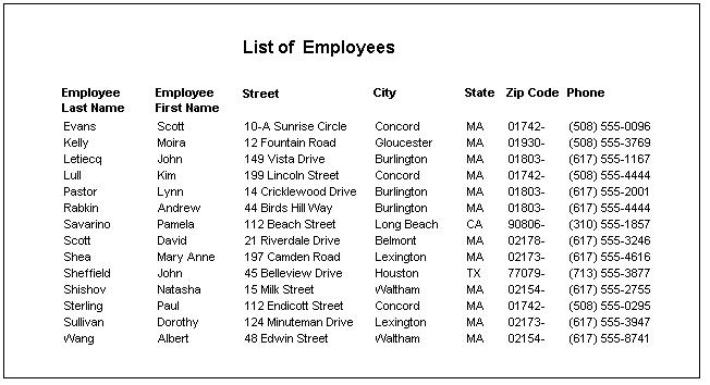
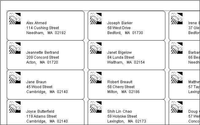
Mailing labels
These mailing labels use the name and address information
from the employee table and a bitmap to mark them with a logo:
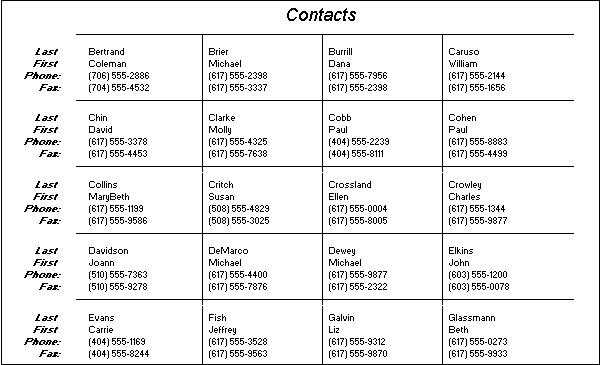
N-up report
This n-up report shows four rows of information next to each
other. Similar to the freeform report, n-up is useful for fitting
more information on the page. N-up is also useful for presenting
periodic information, such as data that repeats for Monday through
Friday (five blocks):
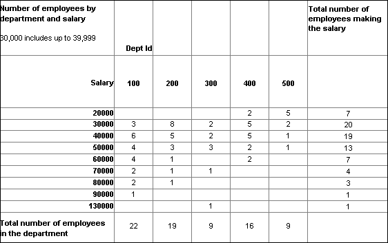
Crosstab
This crosstab report counts the number of employees that fit
into each cell. For example, there are three employees in department
100 who make between $30,000 and $39,999:
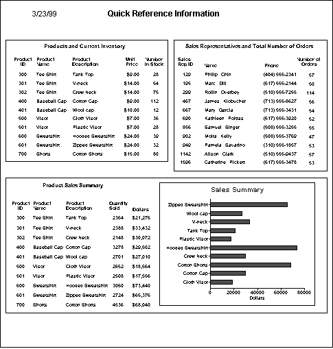
Composite report with nested reports
This composite report consists of three nested tabular reports.
One of the tabular reports includes a graph. Composite reports are
a way to show different reports together on the same page:
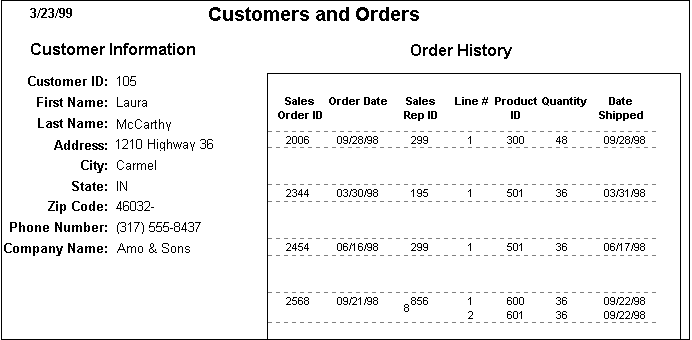
Freeform report with a nested report
This freeform report lists all information about a customer
and includes a related nested report that lists all the orders that
belong to the customer. This is an example of a master/detail
relationship–one customer has many orders: