Using toolbars
Toolbars provide buttons for the most common tasks in PowerBuilder.
You can move (dock) toolbars, customize them, and create your own.
Toolbar basics
PowerBuilder uses three toolbars: the PowerBar, PainterBar,
and StyleBar:
| This toolbar | Has buttons for | And (unless hidden) displays |
|---|---|---|
| PowerBar | Opening painters and tools | Always |
| PainterBar | Performing tasks in the current painter | In each painter or editor. Some painters have more than one PainterBar |
| StyleBar | Changing properties of text, such as font and alignment |
In appropriate painters |
Dropdown toolbars
To reduce the size of toolbars, some toolbar buttons have
a down arrow on the right that you can click to display a dropdown
toolbar containing related buttons.
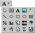
For example, the down arrow next to the Text button in the
DataWindow painter displays the Controls dropdown toolbar, which
has a button for each control you can place on a DataWindow object:
 Default button replaced The button you select from a dropdown toolbar replaces the
default button on the main toolbar. For example, if you select the
Picture button from the Controls dropdown toolbar, it replaces the
Text button in the PainterBar.
Controlling the display of toolbars
You can control:
- Whether
to display individual toolbars and where - Whether to display text on the buttons
- Whether to display PowerTips
Choosing to display text and PowerTips affects all toolbars.
 To control a toolbar using the popup menu:
-
Position the pointer on a toolbar and display
the popup menu. -
Click the items you want.
A checkmark means the item is currently selected.
To control a toolbar using the Toolbars dialog
box:
-
Select Tools>Toolbars from the
menu bar.The Toolbars dialog box displays.
-
Click the toolbar you want to work with (the current
toolbar is highlighted) and the options you want.
PowerBuilder saves your toolbar preferences in the registry
and the PowerBuilder initialization file.
Moving toolbars using the mouse
You can use the mouse to move a toolbar.
To move a toolbar with the mouse:
-
Position the pointer on the grab bar at
the left of the toolbar or on any vertical line separating groups
of buttons. - Press and hold the left mouse button.
-
Drag the toolbar and drop it where you want it.
As you move the mouse, an outlined box shows how the toolbar
will display when you drop it. You can line it up along any frame
edge or float it in the middle of the frame.
Docking toolbars
When you first start PowerBuilder, all the toolbars display
one above another at the top left of the workspace. When you move
a toolbar, you can dock (position) it:
- At the top or
bottom of the workspace, at any point from the left edge to the
right edge - At the left or right of the workspace, at any point
from the top edge to the bottom edge - To the left or right of, or above or below, another
toolbar
Customizing toolbars
You can customize toolbars with PowerBuilder buttons and with
buttons that invoke other applications, such as a clock or text
processor.
Adding, moving, and deleting buttons
You can add, move, and delete buttons in any toolbar.
To add a button to a toolbar:
-
Position the pointer on the toolbar and
display the popup menu. -
Select Customize.
The Customize dialog box displays.
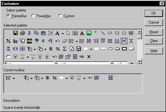
-
Click the palette of buttons you want to use in
the Select palette group. -
Choose a button from the Selected palette box
and drag it to the position you want in the Current toolbar box.If you choose a button from the Custom palette, another dialog
box displays so you can define the button.For more information, see “Adding a custom button”.
Seeing what’s available in the PowerBar PowerBuilder provides several buttons that do not display
by default in the PowerBar, but which you can add. To see what is
available, scroll the list of buttons and select one. PowerBuilder
lists the description for the selected button.
To move a button on a toolbar:
-
Position the pointer on the toolbar, display
the popup menu, and select Customize. -
In the Current toolbar box, select the button
and drag it to its new position.
To delete a button from a toolbar:
-
Position the pointer on the toolbar, display
the popup menu, and select Customize. -
In the Current toolbar box, select the button
and drag it outside the Current toolbar box.
Resetting a toolbar
You can restore the original setup of buttons on a toolbar
at any time.
To reset a toolbar:
-
Position the pointer on the toolbar, display
the popup menu, and select Customize. -
Click the Reset button, then Yes to confirm, then
OK.
Clearing or deleting a toolbar
Whenever you want, you can remove all buttons from a toolbar.
If you don’t add new buttons to the empty toolbar, the
toolbar is deleted. You can delete both built-in toolbars and toolbars
you’ve created.
To recreate a toolbar If you delete one of PowerBuilder’s built-in toolbars,
you can recreate it easily. For example, to recreate the PowerBar,
display the popup menu, select New, and then select PowerBar1 in
the New Toolbar dialog box.
For information about creating new toolbars and about the
meaning of PowerBar1, see “Creating new toolbars”.
To clear or delete a toolbar:
-
Position the pointer on the toolbar, display
the popup menu, and select Customize. -
Click the Clear button, then Yes to confirm.
The Current toolbar box in the Customize dialog box is emptied.
-
Select new buttons for the current toolbar and
click OK.or
Click OK to delete the toolbar.
Adding a custom button
You can add a custom button to a toolbar. A custom button
can:
- Invoke a PowerBuilder
menu item - Run an executable (application) outside PowerBuilder
- Run a query or preview a DataWindow object
- Place a user object in a window or in a custom user
object - Assign a display format or create a computed field
in a DataWindow object
To add a custom button:
-
Position the pointer on the toolbar, display
the popup menu, and select Customize. -
Select Custom in the Select Palette group.
The custom buttons display in the Selected Palette box.
-
Select a custom button and drag it to where you
want it in the Current toolbar box.The Toolbar Item Command dialog box displays. Different buttons
display in the dialog box depending on which toolbar you are customizing: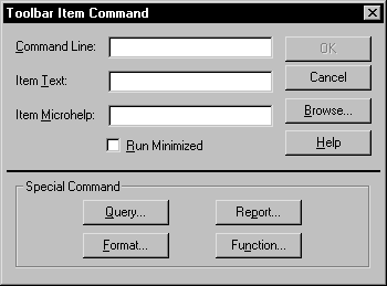
-
Fill in the dialog box as follows:
To have the button Do this Invoke a PowerBuilder menu item Type 1<i>@MenuBarItem.MenuItem</i>in
the Command Line box. For example, to have the button mimic the
Open item on the File menu, type1<i>@File.Open</i>You can also use a number to refer to a menu item. The first
item in a dropdown/cascading menu is 1, the second item
is 2, and so on. Separator lines in the menu count as items. This
example creates a button that pastes a FOR…NEXT statement into
a script:1@Edit.Paste Special.Statement.6Run an executable outside PowerBuilder Type the name of the executable in the
Command Line box. Specify the full path name if the executable is
not in the current search pathTo search for the filename, click the Browse buttonRun a query Click the Query button and select the
query from the displayed listPreview a DataWindow object Click the Report button and select a
DataWindow object from the displayed list. You can then specify command-line
arguments in the Command Line box, as described belowSelect a user object for placement in
a window or custom user object(Window and User Object painters only)
Click the UserObject button and select the user object from the displayed
listAssign a display format to a column in a
DataWindow object(DataWindow painter only) Click the Format
button to display the Display Formats dialog box. Select a data type,
then choose an existing display format from the list or define your
own in the Format boxFor more about specifying display formats, see Chapter 20, “Displaying and Validating
Data “Create a computed field in a DataWindow
object(DataWindow painter only) Click the Function
button to display the Function for Toolbar dialog box. Select the
function from the list -
In the Item Text box, specify the text associated
with the button in two parts separated by a comma: the text that
displays on the button and text for the button’s PowerTip:1<i>ButtonText, PowerTip</i>For example:
1Save, Save FileIf you specify only one piece of text, it is used for both
the button text and the PowerTip. -
In the Item MicroHelp box, specify the text to
appear as MicroHelp when the pointer is on the button.
Modifying a custom button
To modify a custom button:
-
Position the pointer on the toolbar, display
the popup menu, and select Customize. -
Double-click the button in the Current toolbar
box.The Toolbar Item Command dialog box displays.
- Make your changes, as described in “Adding a custom button”.
Creating new toolbars
PowerBuilder has built-in toolbars. When you start PowerBuilder,
you see what is called the PowerBar. In each painter, you also see
one or more PainterBars. But PowerBar
and PainterBar
are
actually types of toolbars you can create to make working in PowerBuilder
easier.
PowerBars and PainterBars
A PowerBar is a toolbar that always displays in PowerBuilder,
unless you hide it. A PainterBar is a toolbar that always displays
in the specific painter for which it was defined, unless you hide
it:
| For this toolbar type | The default is named | And you can have up to |
|---|---|---|
| PowerBar | PowerBar1 | 4 PowerBars |
| PainterBar | PainterBar1 PainterBar2 and so on |
8 PainterBars in each painter |
Where you create them
You can create a new PowerBar anywhere in PowerBuilder, but
to create a new PainterBar, you must be in the workspace of the
painter for which you want to define the PainterBar.
To create a new toolbar:
-
Position the pointer on any toolbar, display
the popup menu, and select New.The New Toolbar dialog box displays.
About the StyleBar In painters that don’t have a StyleBar, StyleBar
is on the list in the New Toolbar dialog box. You can define a toolbar
with the name StyleBar, but you can only add painter-specific buttons,
not style buttons, to it. -
Select a PowerBar name or a PainterBar name and
click OK.The Customize dialog box displays with the Current toolbar
box empty. -
One at a time, drag the toolbar buttons you want
from the Selected palette box to the Current toolbar box and then
click OK.