Working in painters
In PowerBuilder,
you edit objects such as windows, menus, DataWindow objects, and
user objects in painters. In addition to painters that edit objects, other
painters such as the Library painter and the Database painter provide
you with the ability to work with libraries and databases.
Opening painters
Painters that edit objects
There are several
ways you open painters that edit objects:
| From here | You can |
|---|---|
| PowerBar | Click New or Inherit (to create new objects) or Open (to open existing objects) |
| Library painter | Double-click an object or select Edit from the object’s popup menu |
| Browser | Select edit from an object’s popup menu |
Other painters
Most other painters are accessible from the New dialog box.
Some are also available on the PowerBar and from the Window menu.
Painter summary
The PowerBuilder painters
are:
| Painter | What you do |
|---|---|
| Application painter | Specify application-level properties and scripts |
| Database painter | Maintain databases, control user access to databases, manipulate data in databases, and create tables |
| DataWindow painter | Build intelligent objects called DataWindow objects that present information from the database |
| Data Pipeline painter | Transfer data from one data source to another and save a pipeline object for reuse |
| Function painter | Build global functions to perform processing specific to your application |
| Library painter | Manage libraries, create a new library, and build dynamic libraries |
| Menu painter | Build menus that the windows will use |
| Project painter | Create executable files, dynamic libraries, components, and proxies |
| Query painter | Graphically define and save SQL SELECT statements for reuse with DataWindow objects and pipelines |
| Select painter | Graphically define SQL SELECT statements for DataWindow objects and pipelines |
| Structure painter | Define global structures (groups of variables) for use in your application |
| User Object painter | Build custom objects that you can save and use repeatedly in your application |
| Window painter | Build the windows that will be used in the application |
Painter features
Painters that edit objects
Most painters that
edit PowerBuilder objects have these features:
| Feature | Notes |
|---|---|
| Painter window with views | See “Views in painters that edit objects” and “Using views in painters” |
| Unlimited undo/redo | Undo and redo apply to all changes |
| Drag-and-drop operations | Most drag-and-drop operations change context or copy objects |
| To-Do List support | When you are working in a painter, a linked item you add to the To-Do list can take you to the specific location |
Other painters
Most of the painters that do not edit PowerBuilder objects have
views and some drag-and-drop operations.
Views in painters that editobjects
Each painter has a View menu that
you use for opening views. The views you can open depend on the
painter you are working in.
Many views are shared by some painters, but some views are
specific to a single painter. For example, the Layout, Properties,
and Control List views are shared by the Window, visual User Object,
and Application painters, but the Design, Column Specifications,
Data, and Preview views are specific to the DataWindow painter and
the WYSIWYG Menu and Tree Menu views are specific to the Menu painter.
The following sections describe the views you’ll
see in many painters. Views that are specific to a single object
type are described in the chapter for that object type.
Layout view The Layout view shows a representation
of the object and its controls. It is where you place controls on
an object and design the layout and appearance of the object.
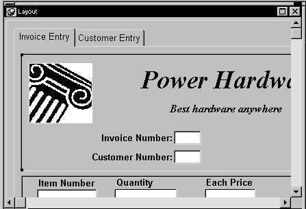
If the Properties view is displayed and you select a control
in the Layout view or the Control List view, the properties for
that control display in the Properties view. If you select several
controls in the Layout view or the Control list view, the properties
common to the selected controls display in the Properties view.
Properties view The Properties view displays the property
sheet for the object itself or for the currently selected controls
or nonvisual objects in the object. You can see and change the values
of properties in this view.
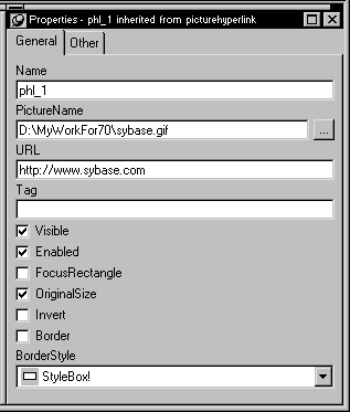
The Properties view dynamically changes when you change selected
objects or controls in the Layout, Control List, and Non-Visual
Object List views.
If you select several controls in the Layout view or the Control
List view, the Properties view says group selected
in
the title bar and displays the properties common to the selected
controls.

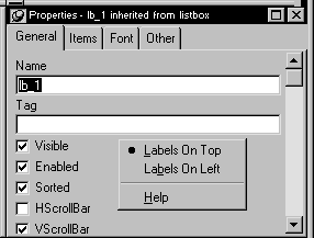
In the Properties view popup menu, you can select Labels On
Top or Labels On Left to specify where the labels for the properties
display. For help on properties, select Help from the popup menu.
If the Properties view is displayed and you select a nonvisual
object in the Non-Visual Object List view, the properties for that
nonvisual object display in the Properties view. If you select several
nonvisual objects in the Non-Visual Object List view, the properties
common to the selected nonvisual objects display in the Properties
view.
Script view The Script view is where you edit the scripts
for events and functions, define and modify user events and functions,
declare variables and external functions, and view the scripts for
ancestor objects.
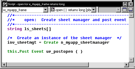
If you double-click a control or object in the Layout, Control
List, or Non-Visual Object List views, the Script view opens (if
it’s not already open) and displays the script for that
control’s default event. If you drag a control or object
from the Layout, Control List, or Non-Visual Object List views to
the Script view (in the Layout view, doing this does not
move
the control), the Script view displays the script for that control’s
default event. Dragging from the Layout, Control List, or Non-Visual
Object List view to Script view is especially useful if you are
using more than one Script view.
If you double-click a function in the Function List view,
the function’s script displays in the Script view. Dragging
a function from the Function List view to the Script view displays
the function’s script. To override a system-defined function,
just type your code in the Script view.
If you double-click an event in the Event List view, its script
displays in the Script view. Dragging an event from the Event List
view to the Script view displays the script for the event. You use
the Prototype window in the Script view (by clicking the button
next to the third dropdown listbox) to modify the event prototype
for a user defined event.
For information about the Script view, see Chapter 4, “Writing Scripts “.
Control List view The Control List view lists the visual
controls on the object. You can click the Control column to sort
the controls by control name or by hierarchy.
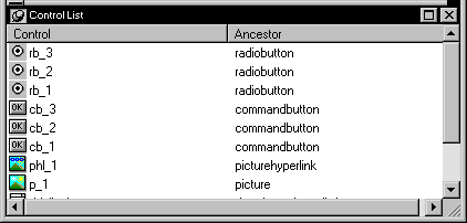
If you select one or more controls in the Control List view,
the controls are also selected in the Layout view. Selecting a control
changes the Properties view and double-clicking a control changes
the Script view.
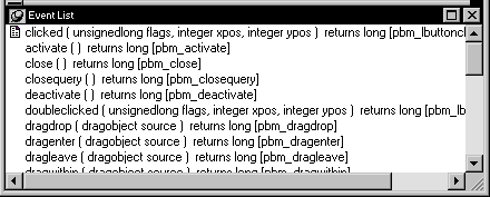
Event List view The Event List view displays
the full event prototype of both the default and user-defined events
mapped to an object. Icons identify whether an event has a script,
is a descendent event with a script, or is a descendent event with
an ancestor script and a script of its own.
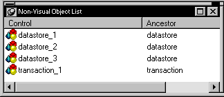
Non-Visual Object List view The Non-Visual Object
List view is a list of nonvisual objects that have been inserted
in an Application object, window, or user object of any type. You
can sort controls by control name or ancestor.
Function List view The Function List view lists the
system-defined functions and the object-level functions you defined
for the object. Icons identify whether a function has a script,
is a descendent of a function with a script, or is a descendent
of a function with an ancestor script and script of its own.
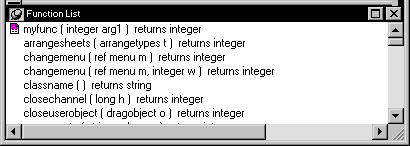
Note that while the half-colored icon identifies the myfunc
user-defined function as having both an ancestor script and a script
of its own, for a function this means that the function is overridden.
This is different from the meaning of a half-colored icon in the
Event List view.
Structure List view The Structure List view lists the
object-level structures defined for the object.
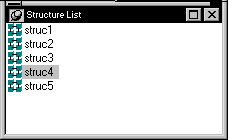
If you double-click a structure in the Structure List view,
the structure’s definition displays in the Structure view.
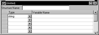
Structure view The Structure view is where you
edit the definition of object-level structures in the Window, Menu,
and User Object painters.
Using views in painters
Most of the PowerBuilder painters
have views. A painter window usually contains several views. Each
provides a specific way of viewing or modifying the object you are
creating or a specific kind of information related to that object.
Here the Layout view shows the window’s layout, and
the Script view shows the code for the selected command button:
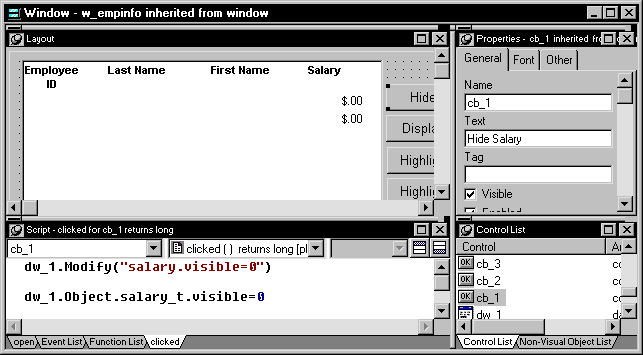
Several views in a painter window mean you can work on more
than one task at a time. In the Window painter, for example, you
can see and modify window controls and code them at the same time.
 To open a view:
-
Select View from the menu bar and then
select the view you want to open.
You can only open one instance of some views, but you can
open as many instances as you need of others, such as the Script
view.
To close a view:
-
If the view’s title bar is not
displayed, display it by placing the pointer on the splitter bar
at the top of the pane. - Click the Close button on the title bar.
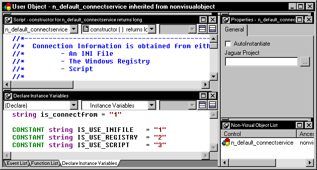
When a painter first opens, the default views display in panes.
In some painters, several panes are overlapped and have tabs you
can click to pop the pane to the top of the stack. Each pane shows
a different view. For some painters, all available views are included
in the default layout; for others, only a few views are included.
Each pane has:
- A title bar you can
display temporarily or permanently - A handle in the top-left corner you can use to drag
the pane to a new location - Splitter bars between the pane and each adjacent
pane
You can change the layout of the views in a painter window
to suit your needs, and you can save different layouts for different
tasks.
Displaying the title bar
For most views a title bar does
not permanently display at the top of a pane (because it’s
often unnecessary). But you can display a title bar for any pane either
temporarily or permanently.
To display a title bar for a pane:
-
Place the pointer on the splitter bar at
the top of the pane.The title bar displays.
-
(Optional) Click the pushpin at the left of the
title bar.or
Select Pinned from the title bar’s popup menu.
The title bar remains visible when you move the pointer. Click
the pushpin again or select Pinned again on the popup menu to hide
the title bar.
After you display a title bar either temporarily or permanently,
you can use the title bar’s popup menu.
To maximize a pane to fill the workspace:
-
Select Maximize from the title bar’s
popup menu.or
Click the Maximize button on the title bar.
To restore a pane to its original size:
-
Select Restore from the title bar’s
popup menu.or
Click the Restore button on the title bar.
Moving and resizing panes
You can move a pane to any location
in the painter window.
To move a pane:
-
Place the pointer anywhere on the pane’s
title bar, hold down the left mouse button, and start moving the
pane. Moving tabbed panes If you move tabbed panes using the handle in the top-left
corner of the top pane or the title bar, all
panes
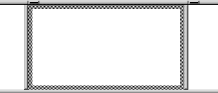
in the stack move. To move one of the panes out of the stack, drag
the tab for the pane you want to move.A gray outline appears in the pane:
-
Drag the outline to the new location.
The outline changes size as you drag it. When the pointer
is over the middle of a pane, the outline fills the pane. As you
drag the pointer toward any border, the outline becomes a narrow
rectangle adjacent to that border. When the pointer is over a splitter
bar between two panes, rows, or columns, the outline straddles the
splitter bar: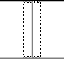 When you move the pointer to a corner When you move the pointer to a corner, you’ll find
that you have many places where you can drop the outline. To see
your options, move the pointer around in all directions in the corner
and see where the outline displays as you move it. -
Release the mouse button to drop the outline in
the new location:To move a pane here Drop the outline here Between two panes On the splitter bar between the panes Between a border and a pane At the side of the pane nearest the border Into a new row On the splitter bar between two rows
or at the top or bottom of the painter windowInto a new column On the splitter bar between two columns
or at the left or right edge of the painter windowOnto a stack of panes On the middle of the pane (if the pane
was not already tabbed, tabs are created)
To resize a pane:
- Drag the splitter bars between panes.
Floating and docking panes
Panes are docked by default within a
painter window. But a particular task may be easier if you float
a pane. A floating pane can be moved outside the painter’s window
or even outside the PowerBuilder window.
You can float and dock panes using the title bar or while
moving a pane.
To float a docked pane:
-
Select Float from the title bar’s
popup menu.or
While moving the pane, press shift or ctrl.
When you open another painter If you have a floating pane in a painter and then open another
painter, the floating pane temporarily disappears. It will reappear
when the original painter is selected.
To dock a floating pane:
-
Select Dock from the title bar’s
popup menu.or
While moving the pane, press shift or ctrl.
Floating and docking a tabbed pane In a tabbed pane, select Float or Dock from the tab’s
popup menu.
Adding and removing panes
You may want to add additional views to the painter window.
For example, you may want more than one Script view. If there are
some views you rarely use, you can move them into an overlapped
stack or remove them.
To add a new pane to the painter window:
-
Select View from the menu bar and then
select the view you want to add.The new pane displays as a new row.
-
Move the pane where you want it.
For how to move panes, see “Moving and resizing panes”.
To remove a pane from the painter window:
-
Display the pane’s title bar if
it is not already visible and select Close from the popup menu (or
click the Close button).or
For a tab in a stack of tabbed panes, select Close from
the popup menu.
Closing tabbed panes Selecting Close
in the title bar of a stack of tabbed panes closes all
the
panes.
Saving a layout
When you have rearranged panes
in the painter window, PowerBuilder saves the layout in the registry.
The next time you open the painter window, your last layout displays.
You can also save customized layouts so that you can switch from
one to another for different kinds of activities.
To save customized layouts for a painter window:
-
Select Design>Options and select
the Layout tab.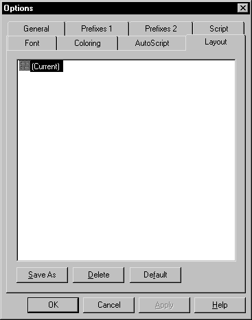
- Click Save As.
-
Type an appropriate name over [Current] and
click OK.
Restoring the default layout You can restore the default
layout anytime by clicking the Default button.
Using popup menus
PowerBuilder provides a context-sensitive popup menu that lists:
- Actions appropriate to the currently
selected object or the current position of the pointer - Where appropriate, a Properties menu item for accessing
the Properties view or the Properties dialog box associated with
the current object or the current position of the pointer
The popup menu is available almost everywhere in PowerBuilder.
Example
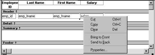
For example, the following screen shows the popup menu for
a column in a DataWindow:
To display a popup menu:
-
Select an object, or position the pointer
on an object or in a view. - Click the right mouse button.
Defining colors
You can define custom colors
to use in most painters and in objects you create.
To define custom colors:
-
In a painter that uses custom colors, select
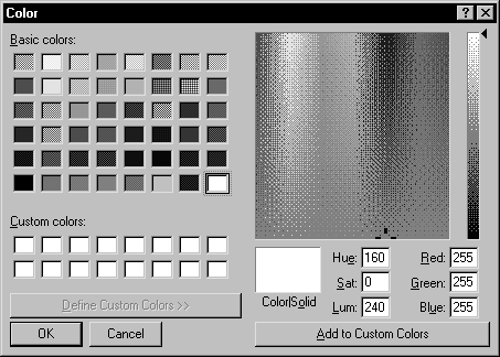
Design>Custom Colors from the menu bar.The Color dialog box displays:
-
Define your custom colors:
Area of the Color dialog box What you do Basic colors Click the basic color closest to the
color you want to define to move the pointer in the color matrix
and slider on the rightCustom colors palette Modify an existing color–click
a custom color, then modify the color matrix and slider. Define
a new color–click an empty box, define the color, and click
Add to Custom ColorsColor matrix Click in the color matrix to pick a color Color slider Move the slider on the right to adjust
the color’s attributesAdd to Custom Colors button After you have designed the color, click
this button to add the custom color to the Custom colors palette
on the left