Toolbar style properties
In addition to customizing the style of a menu, you can
customize the style of a toolbar associated with the menu. For
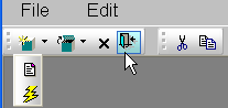
example, the following picture shows a contemporary style toolbar
with an expanded toolbar cascade and a highlighted Exit
button:
Toolbar style properties. Toolbars have style properties that you can change at design
time on the top-level menu object. You can modify these properties
only if you select contemporarytoolbar! as the toolbar style for
the top-level menu object.
|
Property |
Datatype |
Use to assign |
|---|---|---|
|
ToolbarBackColor |
Long |
Background color of the menu |
|
ToolbarGradient |
Boolean |
Gradient of the menu toolbar |
|
ToolbarHighlightColor |
Long |
Highlight color for the toolbar buttons when |
|
ToolbarStyle |
Enumerated |
Overall style of the menu toolbar. Values are: |
|
ToolbarTextColor |
Long |
Color of the text in the menu |
Toolbar item style property. You can select the ToolbarAnimation property for a menu item
toolbar button. This property offsets the button image by two
pixels to the upper left when a user positions the cursor over the
button. You cannot assign this property at the menu object or
toolbar level. You must assign it to individual toolbar items
(buttons) at design time. This property has a Boolean datatype.
You can select it on the Toolbar tab for each menu item below the
top-level menu object. With a contemporary menu, you can set the
ToolbarAnimation property at runtime at runtime using
scripts.
The customizable menu and toolbar styles can be used for MDI
and main windows. Pop-up menus can also use menu style properties.
The styles do not affect existing PowerBuilder applications that use
a traditional style. You can, however, update an existing
PowerBuilder application to use the new styleproperties.