Menu styles
A menu can have a contemporary or traditional style.
|
Menu style |
Description |
|---|---|
|
Contemporary |
A 3D-style menu similar to Microsoft Office 2003 |
|
Traditional |
Window default menu style which has a flat |
Menus that you import or migrate from earlier versions of
PowerBuilder have the traditional style, and new menus use the
traditional menu style by default. The new contemporary menu style has
a three-dimensional menu appearance that can include images and menu
title bands. With a contemporary menu, you can set the MenuAnimation,
MenuImage, and MenuTitleText at runtime using scripts.
You select a menu style on the Appearance tab of the Properties
view for the top-level menu object in the Menu painter. You must
select the top-level menu object in the Tree Menu view of the Menu
painter to display its Properties view.
To specify the menu style
-
Select the top-level menu object.
-
In the Appearance tab page, select the menu style you want,
contemporarymenu! or traditionalmenu!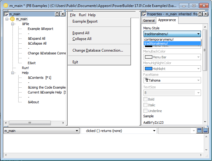
If you select contemporarymenu! in the Menu Style drop-down
list, you can customize the display properties for that style and
have them apply to all menu items in the current menu. If you
select traditionalmenu! the rest of the menu style properties are
grayed.
Images for menus and
toolbars
Contemporary menus can include images. You can use icons,
bitmaps, GIF files, and JPEG files for both contemporary menus and
traditional and contemporary toolbars.
All stock icons have a transparent background. Other icon and
GIF files with transparent backgrounds are always displayed with a
transparent background. If you want a bitmap to display with a
transparent background, the bitmap must use button face as its
background color. This applies whatever the background color of the
menu or toolbar is set to. There is currently no property that allows
you to specify that an image has a transparent background.
When an icon file includes several
images
With the contemporary menu style and toolbar style, when an icon
file includes several images, PowerBuilder uses the following image
selection rules:
|
If the images … |
PowerBuilder displays … |
|---|---|
|
Are all the same size |
8 bit, 16 bit, 24 bit, 32 bit, and 4 bit images |
|
Include 16 bit*16 bit images and also other sized |
16 bit*16 bit images. |
|
Do not include 16 bit*16 bit |
The image with the image size closest to 16 bit. |
|
Are greater than 16 bit images |
The image as 16*16 bit or 32*32 bit. If the icon |