Introduction to RibbonBar items
A RibbonBar control enables you to create ribbons which are a
modern way of organizing user commands in user interfaces. A ribbon can
replace the traditional menu bar and toolbars with tabbed pages (called
Category); and each Category splits into Panels that contain individual
or groups of LargeButton (with or without RibbonMenu), SmallButton (with
or without RibbonMenu), CheckBox, ComboBox, TabButton (with or without
RibbonMenu), and Spin (currently unsupported).
It is recommended that you use the RibbonBar Builder to create the
RibbonBar control (see the next section Creating a RibbonBar using RibbonBar
Builder for details). You can also write scripts to create the
RibbonBar control and the items that composes the control. For details,
refer to the section called “RibbonBar control” in Objects and Controls.
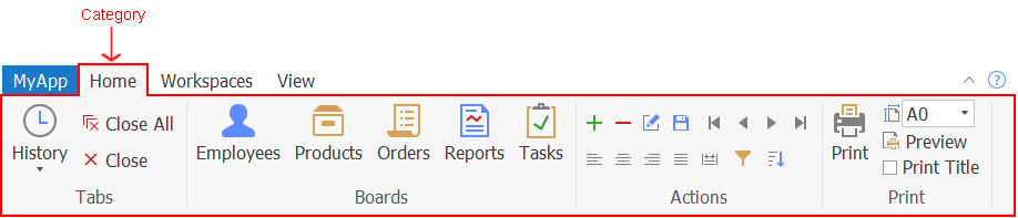
Category
The category is a tab page that organize the functions of the
application.
A RibbonBar control can contain one or more categories; a category
can contain one or more panels:
RibbonBar > Category >
Panel > … (view ribbon
hierarchy)
For example, the following image shows that the RibbonBar control
contains three categories: Home, Workspaces, and View.
For properties/functions of the Category, see the section called “RibbonCategoryItem control” in Objects and Controls. This control has no events or
user events. This control does not support mouse wheel
navigation.
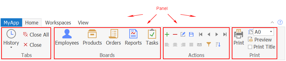
Panel
The panel is used to split the commands in a category into
different groups.
A panel must be placed in a category; and a panel can contain
individual or groups of CheckBox, ComboBox, LargeButton, and
SmallButton:
RibbonBar > Category > Panel > [Group >]
CheckBox/ComboBox/LargeButton/SmallButton (view ribbon
hierarchy)
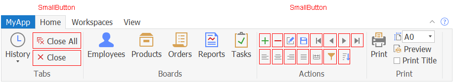
For example, the following image shows that the Home category
contains four panels: Tabs, Boards, Actions, and Print.
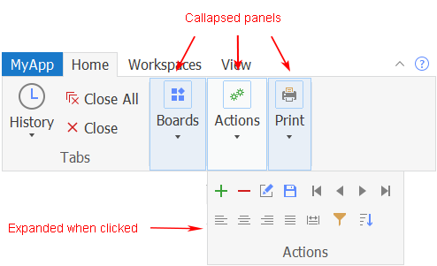
A panel is collapsed automatically (with a drop-down arrow) if
there is not enough space to completely display all of the items in the
panel, for example when the user shrinks the width of the window. You
cannot control when the panel should be collapsed (there is no property
or function to set the collapsed mode for a panel). But you can specify
which picture will display (using the PictureName property of the panel)
when the panel is collapsed.
For properties/functions of the Panel, see the section called “RibbonPanelItem control” in Objects and Controls.
This control has no events or user events.
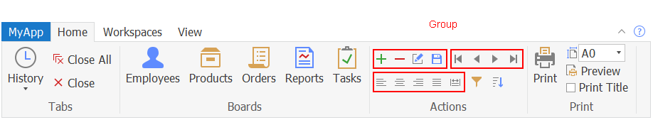
Group
The group organizes related commands and controls within the same
area.
A group must be placed in a panel, and a group can contain one or
more CheckBox, ComboBox, and SmallButton, but cannot contain
LargeButton:
RibbonBar > Category > Panel > Group > CheckBox/ComboBox/SmallButton (view ribbon
hierarchy)
For properties/functions of the Group, see the section called “RibbonGroupItem control” in Objects and Controls.
This control has no events or user events.
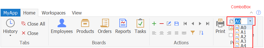
ComboBox
The combo box contains a list box that displays available
choices.
A ComboBox can be placed in a group or panel: RibbonBar >
Category > Panel [> Group] > ComboBox (view ribbon
hierarchy)
For properties/functions of the ComboBox, see the section called “RibbonComboBoxItem control” in Objects and Controls. The Ribbon ComboBox control
has no events. But you can create the Modified user event, the Selected
user event, and the SelectionChanged user event and bind them with this
control. For details, see Modified in PowerScript Reference, Selected in PowerScript Reference, and SelectionChanged in PowerScript Reference.
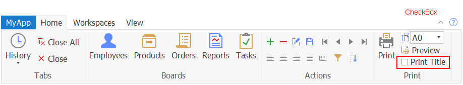
CheckBox
The check box provides a toggle state of an option.
A CheckBox can be placed in a group or panel: RibbonBar >
Category > Panel [> Group] > CheckBox (view ribbon
hierarchy)
For properties/functions of the CheckBox, see the section called “RibbonCheckBoxItem control” in Objects and Controls. The Ribbon CheckBox control
has no events. But you can create the Clicked user event and the
Selected user event and bind them with this control. For details, see
Clicked in PowerScript Reference and Selected in PowerScript Reference.
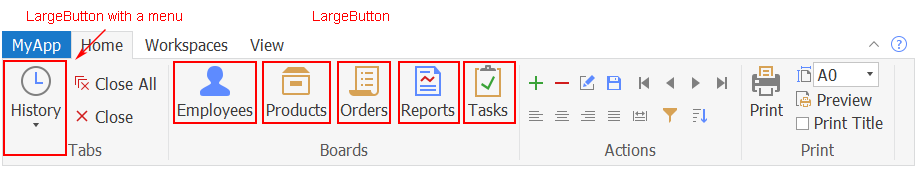
LargeButton
A large button displays an image of 32 * 32 pixels.
A LargeButton can be placed in the panel only; and it can be
associated with a ribbon menu:
RibbonBar > Category > Panel > LargeButton [> RibbonMenu > RibbonMenuItem]
(view ribbon
hierarchy)
For properties/functions of the LargeButton, see the section called “RibbonLargeButtonItem control” in Objects and Controls. The Ribbon LargeButton
control has no events. But you can create the Clicked user event and the
Selected user event and bind them with this control. For details, see
Clicked in PowerScript Reference and Selected in PowerScript Reference.
SmallButton
A small button displays an image of 16 * 16 pixels.
A SmallButton can be placed in a group or panel; and it can be
associated with a ribbon menu:
RibbonBar > Category > Panel [> Group] > SmallButton [> RibbonMenu > RibbonMenuItem]
(view ribbon
hierarchy)
For properties/functions of the SmallButton, see the section called “RibbonSmallButtonItem control” in Objects and Controls. The Ribbon SmallButton
control has no events. But you can create the Clicked user event and the
Selected user event and bind them with this control. For details, see
Clicked in PowerScript Reference and Selected in PowerScript Reference.
RibbonMenu
A ribbon menu is a drop-down list of related commands for a
button. A ribbon menu can be associated with the large button, the small
button, or the tab button:
RibbonBar > Category > Panel > [Group >]
LargeButton/SmallButton > RibbonMenu
> RibbonMenuItem (view ribbon
hierarchy)
RibbonBar > TabButton > RibbonMenu > RibbonMenuItem (view ribbon
hierarchy)
The menu item with the “Normal” or “Separator” type (that is
RibbonMenuItem with ItemType 0 or 1) can be added to RibbonMenu. A
“Separator” menu item is a horizontal line used to visually distinguish
between groups of menu items. RibbonMenu can
contain menu items in no more than two levels. If a
RibbonMenu contains menu items in more than two levels, the ribbon XML
editor will display an error message similar to: “The element cannot
contain text. Content model is empty.”
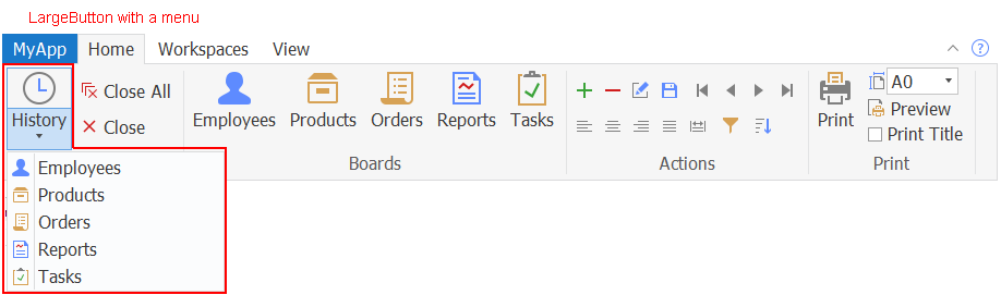
For example, the following image shows that the History large
button is associated with a menu.
For properties/functions of the RibbonMenu, see the section called “RibbonMenu control” in Objects and Controls. This
control has no events or user events.
For properties/functions of the RibbonMenuItem, see the section called “RibbonMenuItem control” in Objects and Controls.
The RibbonMenuItem control has no events. But you can create the Clicked
user event and the Selected user event and bind them with this control.
For details, see Clicked in PowerScript Reference and Selected in PowerScript Reference.
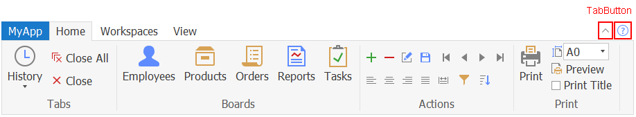
TabButton
The tab button is normally displayed at the top right corner of
the RibbonBar control which provides access to the application-level
settings such as minimize, help, etc. A tab button can show text if you
specify no picture for it.
A RibbonBar control can contain one or more tab buttons; and a tab
button can be associated with a ribbon menu:
RibbonBar > TabButton [>
RibbonMenu > RibbonMenuItem] (view ribbon
hierarchy)
For properties/functions of the TabButton, see the section called “RibbonTabButtonItem control” in Objects and Controls. The Ribbon TabButton control
has no events. But you can create the Clicked user event and the
Selected user event and bind them with this control. For details, see
Clicked in PowerScript Reference and Selected in PowerScript Reference.
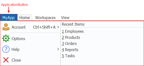
ApplicationButton
The application button is normally displayed at the top left
corner of the RibbonBar control which provides end users with easy
access to the main menu of your application.
Only one application button is allowed in a ribbon bar, therefore,
you can get, set, or remove the application button without needing to
insert the application button first or identify the application button
by its handle. The application button must be associated with an
application menu.
RibbonBar > ApplicationButton
> … (view ribbon
hierarchy)
For example, the following image shows that the RibbonBar control
contains a “MyApp” application button.
For properties/functions of the ApplicationButton, see the section called “RibbonApplicationButtonItem control” in Objects and Controls. This control has no
events or user events.
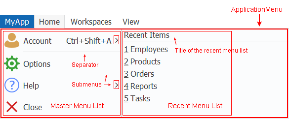
ApplicationMenu
The application menu is the main menu of your application; it
usually contains two menus: a master menu on the left and a recent menu
on the right. The application menu is associated with the application
button.
RibbonBar > ApplicationButton > ApplicationMenu > RibbonMenuItem (view ribbon
hierarchy)
-
Master menu — The master menu is a pane in the application
menu that displays the main menu items for an application. The menu
item with the “Normal” or “Separator” type (that is RibbonMenuItem
with ItemType 0 or 1) can be added as a master menu item. A
“Separator” menu item is a horizontal line used to visually
distinguish between groups of menu items.The master menu can have no more than two levels. If the
master contains menu items in more than two levels, the ribbon XML
editor will display an error message similar to: “The element cannot
contain text. Content model is empty.” -
Recent menu — The recent menu is a pane in the application
menu that displays the most recently used items for an application.
You can specify a text title for the recent menu (using the
SetRecentTitle function), for example, “Recent Items”, “Recently
Opened Windows” etc.The menu item with the “Recent” type (that is RibbonMenuItem
with ItemType 2) can be added as a recent menu item. The recent menu
item will not show picture even if you have specified a picture for
it (using the PictureName property of RibbonMenuItem). No separator
line can be added to the recent menu.The recent menu can have only one level; and can contain no
more than 9 items.
For properties/functions of the ApplicationMenu, see the section called “RibbonApplicationMenu control” in Objects and Controls. This control has no events
or user events.
For properties/functions of the RibbonMenuItem, see the section called “RibbonMenuItem control” in Objects and Controls.
The RibbonMenuItem control has no events. But you can create the Clicked
user event and the Selected user event and bind them with this control.
For details, see Clicked in PowerScript Reference and Selected in PowerScript Reference.
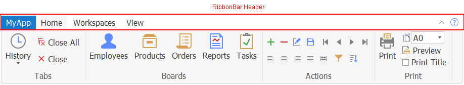
RibbonBar Header
The RibbonBar header is not an individual control; it is the area
composed of the application button title, the category title, and the
tab header on the same horizontal level.
The header can be set to invisible (by using the HideTabHeader
property), and the RibbonBar can be minimized to display the header only
(by using the SetMinimized function). When the RibbonBar is minimized,
the HideTabHeader property cannot be set to TRUE. When the HideTabHeader
property is set to TRUE, the SetMinimized function will not take
effect.
For more, see the section called “SetMinimized” in PowerScript Reference and the section called “HideTabHeader” in Objects and Controls.