Examples
This section shows how to specify the data for several
different graphs of the data in the Printer table in the PB Demo DB.
The table records quarterly unit sales of three printers by three
sales representatives.
|
Rep |
Quarter |
Product |
Units |
|---|---|---|---|
|
Simpson |
Q1 |
Stellar |
12 |
|
Jones |
Q1 |
Stellar |
18 |
|
Perez |
Q1 |
Stellar |
15 |
|
Simpson |
Q1 |
Cosmic |
33 |
|
Jones |
Q1 |
Cosmic |
5 |
|
Perez |
Q1 |
Cosmic |
26 |
|
Simpson |
Q1 |
Galactic |
6 |
|
Jones |
Q1 |
Galactic |
2 |
|
Perez |
Q1 |
Galactic |
1 |
|
… |
… |
… |
… |
|
Simpson |
Q4 |
Stellar |
30 |
|
Jones |
Q4 |
Stellar |
24 |
|
Perez |
Q4 |
Stellar |
36 |
|
Simpson |
Q4 |
Cosmic |
60 |
|
Jones |
Q4 |
Cosmic |
52 |
|
Perez |
Q4 |
Cosmic |
48 |
|
Simpson |
Q4 |
Galactic |
3 |
|
Jones |
Q4 |
Galactic |
3 |
|
Perez |
Q4 |
Galactic |
6 |
Graphing total sales
To graph total sales of printers in each quarter, retrieve all
the columns into a DataWindow object and create a graph with the
following settings on the Data page in the Properties view:
-
Set Rows to All
-
Set Category to quarter
-
Set Value to sum(units for graph)
-
Leave the Series check box and text box empty.
The Quarter column serves as the category. Because the Quarter
column has four values (Q1, Q2, Q3, and Q4), there will be four
categories along the Category axis. You want only one series (total
sales in each quarter), so you can leave the Series box empty, or
type a string literal to identify the series in a legend. Setting
Value to sum(units for graph) graphs total sales in each
quarter.
Here is the resulting column graph. PowerBuilder automatically
generates the category text based on the data in the table:
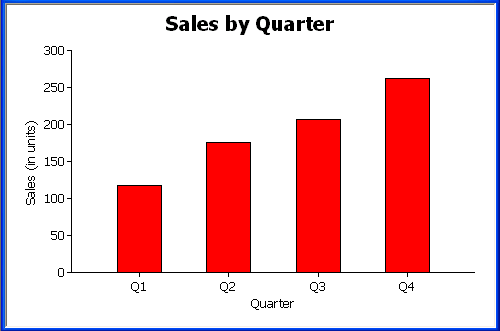
In the preceding graph, there is one set of data points (one
series) across four quarters (the category values).
The following is a pie graph, which has exactly the same
properties as the preceding column graph except for the type, which
is Pie:
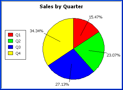
In pie graphs, categories are shown in the legend.
Graphing unit sales of each
printer
To graph total quarterly sales of each printer, retrieve all
the columns into a DataWindow object and create a graph with the
following settings on the Data page in the Properties view:
-
Set Rows to All
-
Set Category to quarter
-
Set Value to sum(units for graph)
-
Select the Series check box
-
Set Series to product
You want a different series for each printer, so the column
Product serves as the series. Because the Product column has three
values (Cosmic, Galactic, and Stellar), there will be three series
in the graph. As in the first example, you want a value for each
quarter, so the Quarter column serves as the category, and you want
to graph total sales in each quarter, so the Value box is specified
as sum(units for graph).
Here is the resulting graph. PowerBuilder automatically
generates the category and series labels based on the data in the
table. The series labels display in the graph’s legend:
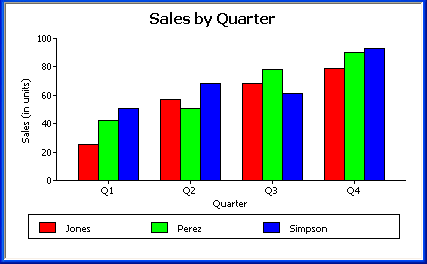
Graphing unit sales by
representative
To graph quarterly sales made by each representative, create a
graph with the following settings on the Data page in the Properties
view:
-
Set Rows to All
-
Set Category to quarter
-
Set Value to sum(units for graph)
-
Select the Series check box
-
Set Series to rep
Here is the resulting graph:
Graphing unit sales by representative
and total sales
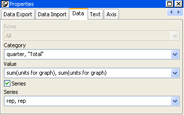
To graph quarterly sales made by each representative, plus
total sales for each printer, create a graph with the following
settings on the Data page in the Properties view:
-
Set Rows to All
-
Set Category to quarter, “Total”
-
Set Value to sum(units for graph), sum(units for
graph) -
Select the Series check box
-
Set Series to rep, rep
Here you have two types of categories: the first is Quarter,
which shows quarterly sales, as in the previous graph. You also want
a category for total sales. There is no corresponding column in the
DataWindow object, so you can simply type the literal “Total” to
identify the category. You separate multiple entries with a
comma.
For each of these category types, you want to graph the sum of
units sold for each representative, so the Value and Series values
are repeated.
Here is the resulting graph:
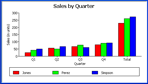
Notice that PowerBuilder uses the literal “Total” supplied in
the Category box in the Graph Data window as a value in the Category
axis.
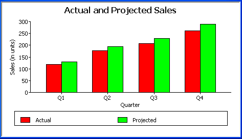
Graphing actual and projected
sales
To graph total quarterly sales of all printers and projected
sales for next year, create a graph with the following settings on
the Data page in the Properties view (you assume that sales will
increase by 10% next year):
-
Set Rows to All
-
Set Category to quarter
-
Set Value to sum(units for graph), sum(units*1.1 for
graph) -
Select the Series check box
-
Set Series to ‘Actual’,’Projected’
You are using labels to identify two series, Actual and
Projected. Note the single quotation marks around the literals. For
Values, you enter the expressions that correspond to Actual and
Projected sales. For Actual, you use the same expression as in the
examples above, sum(units for graph). For Projected sales, you
multiply each unit sale by 1.1 to get the 10 percent increase.
Therefore, the second expression is sum(units*1.1 for graph).
Here is the resulting graph. PowerBuilder uses the literals
you typed for the series as the series labels in the legend: