EditMask
Sometimes users need to enter data that has a fixed format. For
example, U.S. and Canadian phone numbers have a three-digit area code,
followed by three digits, followed by four digits. You can use an
EditMask control that specifies that format to make it easier for
users to enter values. Think of an EditMask control as a smart
SingleLineEdit: it knows the format of the data that can be
entered.
An edit mask consists of special characters that determine what
can be entered in the box. An edit mask can also contain punctuation
characters to aid the user.
For example, to make it easier for users to enter phone numbers
in the proper format, you can specify the following mask, where #
indicates a number:
|
1 |
(###) ###-#### |
At runtime, the punctuation characters (the parentheses and
dash) display in the box and the cursor jumps over them as the user
types.
Masks in EditMask controls in windows work in a similar way to
masks in display formats and in the EditMask edit style in DataWindow
objects. For more information about specifying masks, see the
discussion of display formats in Displaying and Validating
Data.
Edit mask character for Arabic and Hebrew
The b mask character allows the entry of Arabic characters
when you run PowerBuilder on an Arabic-enabled version of Windows
and Hebrew characters when running on a Hebrew-enabled version. It
has no effect on other operating systems.
To use an EditMask control
-
Select the EditMask to display its properties in the
Properties view. -
Name the control on the General property page.
-
Select the Mask tab.
-
In the MaskDataType drop-down list, specify the type of data
that users will enter into the control. -
In the Mask edit box, type the mask.
You can click the button on the right and select masks. The
masks have the special characters used for the specified data
type. -
Specify other properties for the EditMask control.
For information on the other properties, right-click in any
tab page in the Properties view and select Help from the pop-up
menu.
Control size and text entry
The size of the EditMask control affects its behavior. If the
control is too small for the specified font size, users might not be
able to enter text.
To correct this, either specify a smaller font size or resize
the EditMask control.
Validation for EditMask
controls
The EditMask control checks the validity of a date when you
enter it, but if you change a date so that it is no longer valid, its
validity is not checked when you tab away from the control. For
example, if you enter the date 12/31/2016 in an EditMask control with
the mask mm/dd/yyyy, you can delete the 1 in 12, so that the date
becomes 02/31/2016. To catch problems like this, add validation code
to the LoseFocus event for the control.
Keyboard behavior
Some keystrokes have special behavior in EditMask controls. For
more information, see The EditMask edit
style.
Using a drop-down
calendar
You can use a drop-down calendar that is similar to the
DatePicker control in EditMask controls that have a Date or DateTime
edit mask. The user can choose to edit the date in the control or to
select a date from a drop-down calendar.
To specify that an EditMask control uses a drop-down calendar to
display and set dates, select the Drop-down Calendar check box on the
Mask page in the Properties view. You can set display properties for
the calendar on the Calendar page. Users navigate and select dates
within the calendar as they do in the calendar in a DatePicker
control.
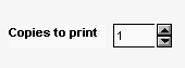
Using spin controls
You can define an EditMask as a spin control, which is an edit
control that contains up and down arrows that users can click to cycle
through fixed values. For example, assume you want to allow your users
to select how many copies of a report to print. You could define an
EditMask as a spin control that allows users to select from a range of
values.
To define an EditMask as a spin control
-
Name the EditMask and provide the data type and mask, as
described above. -
Select the Spin check box on the Mask property page.
-
Specify the needed information.
For example, to allow users to select a number from 1 to 20
in increments of 1, specify a spin range of 1 to 20 and a spin
increment of 1.
For more information on the options for spin controls,
right-click in any tab page in the Properties view and select Help
from the pop-up menu.