Customizing toolbars
Contents
You can customize toolbars with PowerBuilder buttons and with
buttons that invoke other applications, such as a clock or text
processor.
Adding, moving, and deleting
buttons
You can add, move, and delete buttons in any toolbar.
To add a button to a toolbar
-
Position the pointer on the toolbar and display the pop-up
menu. -
Select Customize.
The Customize dialog box displays. The icons that display in
the selected palette and current toolbar panes depend on the
palette and toolbar you select.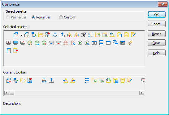
-
Click the palette of buttons you want to use in the Select
Palette group box. -
Choose a button from the Selected Palette box and drag it to
the position you want in the Current Toolbar box.The function of the button you selected displays in the
Description at the bottom of the dialog box. If you choose a
button from the Custom palette, another dialog box displays so you
can define the button.For more information, see Adding a
custom button.
To move a button on a toolbar
-
Position the pointer on the toolbar, display the pop-up
menu, and select Customize. -
In the Current toolbar box, select the button and drag it to
its new position.
To delete a button from a toolbar
-
Position the pointer on the toolbar, display the pop-up
menu, and select Customize. -
In the Current toolbar box, select the button and drag it
outside the Current toolbar box.
Resetting a toolbar
You can restore the original setup of buttons on a toolbar at
any time.
To reset a toolbar
-
Position the pointer on the toolbar, display the pop-up
menu, and select Customize. -
Click the Reset button, then Yes to confirm, then OK.
Clearing or deleting a
toolbar
Whenever you want, you can remove all buttons from a toolbar. If
you do not add new buttons to the empty toolbar, the toolbar is
deleted. You can delete both built-in toolbars and toolbars you have
created.
To recreate a toolbar
If you delete one of PowerBuilder’s built-in toolbars, you can
recreate it easily. For example, to recreate the PowerBar, display
the pop-up menu, select New, and then select PowerBar1 in the New
Toolbar dialog box.
For information about creating new toolbars and about the
meaning of PowerBar1, see Creating new
toolbars.
To clear or delete a toolbar
-
Position the pointer on the toolbar, display the pop-up
menu, and select Customize. -
Click the Clear button, then Yes to confirm.
The Current toolbar box in the Customize dialog box is
emptied. -
If you want to add new buttons, select them.
-
Click OK to save the toolbar if you added new buttons, or
delete the toolbar if you did not.
Adding a custom
button
You can add a custom button to a toolbar. A custom button
can:
-
Invoke a PowerBuilder menu item
-
Run an executable (application) outside PowerBuilder
-
Run a query or preview a DataWindow object
-
Place a user object in a window or in a custom user
object -
Assign a display format or create a computed field in a
DataWindow object
To add a custom button
-
Position the pointer on the toolbar, display the pop-up
menu, and select Customize. -
Select Custom in the Select Palette group box.
The custom buttons display in the Selected Palette
box. -
Select a custom button and drag it to where you want it in
the Current Toolbar box.The Toolbar Item Command dialog box displays. Different
buttons display in the dialog box depending on which toolbar you
are customizing: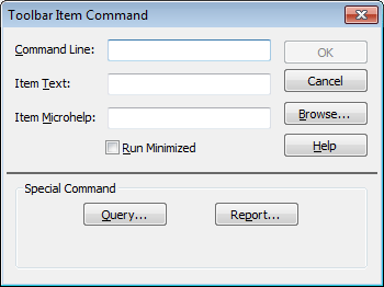
-
Fill in the Command Line box using the following
table.In the Item Text box, specify the text associated with the
button in two parts separated by a comma: the text that displays
on the button and text for the button’s PowerTip:1ButtonText, PowerTipFor example:
1Save, Save FileIf you specify only one piece of text, it is used for both
the button text and the PowerTip. -
In the Item MicroHelp box, specify the text to appear as
MicroHelp when the pointer is on the button.Button action
Toolbar Item Command dialog box
entryInvoke a PowerBuilder menu
itemType @MenuBarItem.MenuItem in the Command
Line box. For example, to make the button mimic the Open
item on the File menu, type:1@File.OpenIf
a menu label contains a dot (“.”), you must include the
tilde (“~”) as an escape character to indicate the dot is
part of the label and does not invoke a submenu item. For
example:1@Tools.Toolbars~.~.~.You
can also use a number to refer to a menu item. The first
item in a drop-down or cascading menu is 1, the second
item is 2, and so on. Separator lines in the menu count as
items. This example creates a button that pastes a
FOR…NEXT statement into a script:1@Edit.Paste Special.Statement.6Run an executable file outside
PowerBuilderType the name of the executable file in the
Command Line box. Specify the full path name if the
executable is not in the current search
path.To search for the file name, click the
Browse button.Run a query
Click the Query button and select the query
from the displayed list.Preview a DataWindow object
Click the Report button and select a
DataWindow object from the displayed list. You can then
modify the command-line arguments in the Command Line
box.Select a user object for placement in a
window or custom user object(Window and User Object painters only) Click
the UserObject button and select the user object from the
displayed list.Assign a display format to a column in a
DataWindow object(DataWindow painter only) Click the Format
button to display the Display Formats dialog box. Select a
data type, then choose an existing display format from the
list or define your own in the Format box.For
more about specifying display formats, see Displaying and
Validating Data.Create a computed field in a DataWindow
object(DataWindow painter only) Click the Function
button to display the Function for Toolbar dialog box.
Select the function from the list.