Customizing the Tab control
The Tab control has settings for controlling the position and
appearance of the tabs. Each tab can have its own label, picture, and
background color.
All tabs share the same font settings, which you set on the Tab
control’s Font property page.
Pop-up menus and property sheets for Tab
controls and tab pages
A Tab control has several elements, each with its own pop-up menu
and property sheet. To open the property sheet, double-click or select
Properties on the pop-up menu.
Where you click determines what element you access.
|
To access the pop-up menu or property sheet for |
Do this |
|---|---|
|
Tab control |
Right-click or double-click in the tab area of the |
|
Tab page |
Click the tab to make the tab page active, then |
|
Control on a tab page |
Click the tab to make the tab page active and |
Position and size of tabs
The General tab in the Tab control’s property sheet has several
settings for controlling the position and size of the tabs.
|
To change |
Change the value for |
|---|---|
|
The side(s) of the Tab control on which the tabs |
Tab Position |
|
The size of the tabs relative to the size of the Tab |
Ragged Right, MultiLine, Fixed Width |
|
The orientation of the text relative to the side of |
Perpendicular Text |
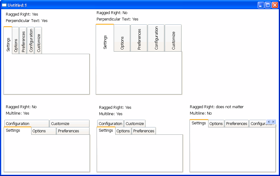
Fixed Width and Ragged Right
When Fixed Width is checked, the tabs are all the same size. This
is different from turning Ragged Right off, which stretches the tabs to
fill the edge of the Tab control, like justified text. The effect is the
same if all the tab labels are short, but if you have a mix of long and
short labels, justified labels can be different sizes unless Fixed Width
is on.
This figure illustrates the effect of combining some of these
settings. Tab Position is Top:
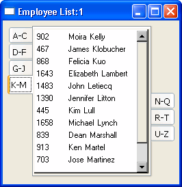
This sample Tab control is set up like an address book. It has tabs
that flip between the left and right sides. With the Bold Selected Text
setting on and the changing tab positions, it is easy to see which tab is
selected:
Tab labels
You can change the appearance of the tab using the property sheets
of both the Tab control and the Tab page.
|
Property sheet |
Property page |
Setting |
Affects |
|---|---|---|---|
|
Tab control |
General |
PictureOnRight, ShowPicture, ShowText |
All tabs in the control |
|
Tab page |
General |
Text, BackColor |
The label on the tab and the background color of the |
|
Tab page |
TabPage |
PictureName, TabTextColor, TabBackColor, |
The color of the text and picture on the tab and the |
If you are working in the User Object painter on an object you will
use as a tab page, you can make the same settings on the TabPage page of
the user object’s property sheet that you can make in the tab page’s
property sheet.
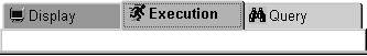
This example has a picture and text assigned to each tab page. Each
tab has a different background color. The Show Picture and Show Text
settings are both on:
Changing tab appearance in
scripts
All these settings in the painter have equivalent properties that
you can set in a script, allowing you to change the appearance of the Tab
control dynamically during execution.