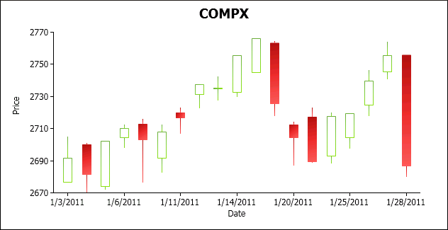
Candlestick Graphs
Use the candlestick graph to visually display the prices of stocks, bonds, commodities, and so on.
- The end points of the line show the highest price and the lowest price at the date or time.
- The top and bottom of the rectangle show the opening price and closing price, which depends on whether the opening price is higher or lower than the closing price.
- An empty rectangle indicates that there was appreciation. A filled rectangle indicates depreciation.
Using the Palette
You can define palettes for any graph, which is useful for setting colors; for example, in some countries red has a negative connotation and is used for depreciation, but in other countries it has a positive connotation and is used for appreciation.
- The brush color at index 0 is for depreciation.
- The brush color at index 1 is for appreciation.
Parent topic: WPF DataWindow Enhancements
Document get from Powerbuilder help
Thank you for watching.
Subscribe
Login
0 Comments
Oldest